Sunday 8 September 2013

I am marching to the beat... Part Holy Roar

Sometime in late 2010 (November maybe?), Touche Amore hit the UK and Europe in support of ...To the Beat of a Dead Horse. This occasion was celebrated with a one time UK pressing of To the Beat on Holy Roar records. Alex over at Holy Roar went all out on this, and it really paid off well, as it looks fantastic. There are tons of cool extras added in here, but more about that after we've had a look at the records!

As a one time pressing of 500, the colours we're split to 100 and 400. So here we go: 100 black/white split.


Next up is black/400. Out of the two I stumbled upon this copy first, completely by accident with a cheap Buy It Now deal on eBay.


That was kind of short and sweet right? Now on to the fun stuff! This pressing stands out because so much actually changed here, making it a really desirable variant for anyone interested in this band. First off, although a little hard to notice on a photo, this particular pressing was a 10'' as opposed to a 12''. It also contained 4 bonus live tracks from their hometown venue Chain Reaction, placing 15 tracks onto a 10''. For you audiophile nerds out there, at best those 4 tracks add at best 6 minutes to an album that clocks in at under 20 minutes, so the pressing wasn't affected in any way and still sounds great. But hopefully you begin to see what I mean by going all out on this one!

Now, on to the design changes. As mentioned in my previous post, the album cover has been re-drawn a few times over the various pressings/issues of the album to accommodate the amount of space Nick had to play with. I caught up with him after one of their shows last year and asked him about it. He said that the original had two much detail in the rain, and on a 10'' cover as opposed to a 12'', the rain merged and look messy so it was re-drawn.

Here are some close up's of the two covers to show some comparisons. Here's the 10''


And here's the 12'' . The rain is the most notable difference here, but pay close attention to the cloud shape, the figure on the bike; there are quite a few big changes here. There's something that really gets me about the cover being re-drawn; again it really makes it worth it for anyone with a 12'' copy for closer comparison. And the extra tracks are great too. Really capturing the live sound of this band, and how mental a hometown audience can get!


There are another couple of differences here that I completely forgot to take pictures of. For example, the massively oversized sticker on the 10'' cover... The 12'' copies in the first two presses also had these stickered sleeves, but the sticker were a lot smaller. There's probably some inside joke about the smaller record needing a bigger sticker or something. By the 3rd press however the gatefolds were too thick and so didn't come in a poly sleeve, so the sticker was dropped.

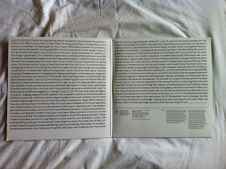
Also, from the first two photos, you can see that the lyrics and thanks are printed on the inner sleeve as opposed to an insert. This looks really great as both sides are absolutely plastered with information. With both records only being in black or black/white, this also provides a cool continuity with the colour theme. It just works, and it looks awesome. I've probably missed another thing or two I forgot to photograph, like the inclusion of the Holy Roar logo on the back cover along with the 6131/ Collect logos. And the oversized outer sleeve, but how many photos can a guy take?

Either way, this variant is definitely worth hunting down if you're a fan of this LP, it makes a great comparison to the 12'' and the bonus tracks are killer. I'm still missing the t-shirt that came with this pre-order. If anyone has one and wants to hook a guy up, let me know!

One more post on this one, and then we can move on to some other cool other stuff!
Thanks for reading! Kane


I am marching to the beat... Part 3

In this entry I'm going to run through the 3rd, 4th and 5th pressings. From the 3rd press onwards, the design of the sleeve has stayed consistent, but there are quite a few changes between these presses and the two before them.

But first lets have a look at the vinyl shall we?

The 3rd press consists of one colour, solid white /750. From the 3rd press onwards too, the record is pressed on 180gram as opposed to the 150 gram vinyl of previous pressings. However as a downside, there is no longer any 'element' tie-in to the colour scheme of the records, ruined my fun.


The 4th press is remarkably similar to the 3rd press. It comes in cream /1000.


Yes, believe it or not these two are completely different pressings. You have to see them in person to really see any real difference, but it's cool I guess. I think the label had caught on to the similarity of the two and so added a IV to the centre label of the 4th press.


Next up is the 5th press, clear/ 1000. I was a little worried about this one, as I heard some stories about this press skipping loads and having cracks or splits in the record. Mine took a little longer to arrive this side of the pond, but I have no complaints about it, it arrived looking fine and plays perfectly. As a bonus, it looks really nice too!


The HUGE design change here, is that the record is now housed in a gatefold sleeve as opposed to the standard sleeves of previous pressings.


The gatefold is great though. The huge two sided poster was dropped in favour of a printed inner gatefold, housing all the lyrics and thank you's etc. making it a lot more convenient for first time listeners who want to follow the lyrics. I love the poster that came with earlier pressings, but it's never a bad idea to shake things up design wise to keep things interesting for people that own multiple copies. Again, everything was designed by Nick Steinhardt.

Another quirky little detail is that the cd sleeve follows this pattern. I know most people don't give a damn about cd's but I think anything Touche related is worth buying. Plus, the cover of the album was actually re-drawn for the cd. In fact, to my knowledge, the cover has been re-drawn 3 times to fit three different issues of the album. But more on that later!


Thanks for reading! Kane

Saturday 7 September 2013

I am marching to the beat... Part 2

Okay so by now we should all know how I feel about this album. Here's when things can get a little more interesting. The second press had a couple of small but significant design changes. Let's have a look!


 First up is 2nd press clear green (herb) /420; nothing too spectacular to see here, but it's a great colour and continues the 'elements' theme through the pressings.


Next up is 2nd press of light blue (rain) /500. This one gathers a bit of interest. Due to the varying amounts of white splatter in the mix; I've seen copies that are practically solid blue and others that contain heavy amounts of white. I think mine is a nice mid ground; that isn't to say I would say no to a drastically different variation! This could probably be my favourite variant of this record. I managed to score both of these from friend and cool collector named Dan Flanagan, who's since taken tons of my money. The guy has a complete Full of Hell collection that is pretty damn impressive, have a look at fleshin2gear.tumblr.com


Now to the possibly more interesting bits, the design changes between the two pressings! I get real into nerdy stuff like this, not even a little ashamed.

The printed dust sleeve here came with the first press. I thought this was super cool at the time because it was the first time I had seen a heavily printed sleeve. It just looked great alongside the black and white art and looked very DIY, I still get taken back whenever I look at it. Whilst spinning this LP I still look at it, digesting all the information and marvelling at that great live shot.


However, by the second press, stuff got changed up a little! The printed dust sleeves were scrapped in favour of this insert. Again, this interested me as the insert has been cut down to an odd size. The layout of the text and photos is a bit of a weird one too. But what gets me more is the amendment of the information across the two inserts:

 One thing that immediately stuck out in the first press insert was the fact that no drummer was listed with the band members, although it does credit Jeremy Zsupnik under 'drum tracking'. Jeremy performed drums on the demo 7'' and To the Beat... but by the time the LP came to press he was no longer with the band. However, by the second press insert, Elliot Babin was added with the rest of the band members and a full time member of TA. Jeremy Zsupnik is still credited under 'drum tracking' through all of the pressings. There is also some editing in the thank you's; the inclusion of Pianos Become the Teeth on the second press insert is one I remember off the top of my head


Another weird little extra is the cd's that came free with the first two pressings of the LP. Some are white, some are clear, but they seem randomly mixed in. Both pressings contain both colours of the cd and I'm kind of stumped about it, so if anyone has any answers let me know! And yes, that is a heartagram tattoo you see. Moving swiftly on... 


In the first two pressings, there was also a huge two-sided poster included with every copy of the LP (as far as I'm aware). The only copy I own that doesn't include a poster is the brown/300 1st press. Presumably the seller kept it. I can't complain. I have at least 6 of them all in the sleeves that most likely will never get used because I'm far too precious about stuff like this. Maybe one day I'll hang one in a nice frame to go with my Parting the Sea Between Brightness and Me (TA's second LP) print.

Front


Back


I apologise that these pictures are a little off centre. It's hard taking a photo of a 24'' by 36'' poster when you're a short dude armed with only an iPhone. It's a shame that these are just tucked away in sleeves, they look incredible. I love the artwork, and the lyrics printed on the back is a great addition (although a little awkward to try and read due to the size of the poster). Again, all of the design work here was done by guitarist and design guy Nick Steinhardt under the company name of 23in. The dude comes up with some pretty incredible design work. You'll see plenty of it in this blog over time!

Anyway, that about covers the second pressing and comparisons. Don't worry herbs I haven't forgot about the tour versions of the first two pressings, I'm doing a post on all the tour/special editions and linking it all in (in my head it seems organised but we will see!). My next post will tackle out the third, fourth and fifth pressing of this LP as they're all single colour pressings. And yes I'll get nerdy and weird over the packaging. It will be real fun though I promise. Only another three posts on this album and I'll be done! Maybe I'll take a little break from TA posting then (not for long of course), I've bought some super cool records lately that I can't keep hidden away for much longer...

Thanks for reading! Kane