Friday 31 October 2014

Fade Tapes

This is definitely up there with my favourite demo releases of 2013. Finally, over a year after being around it is finally seeing a vinyl release courtesy of Rich at Speedowax. But today we're not talking about the vinyl copies (they're on their way though). We're going back to good ol' fashioned demo tapes. 


3 separate presses - all self released. I think the pressing goes: 
Red Cover /50
Blue Cover /30
Green Cover /50 

But I could be wrong. 


Red was the 1st colour released, making it the 1st press I guess. Clear shells with stickered sides. 


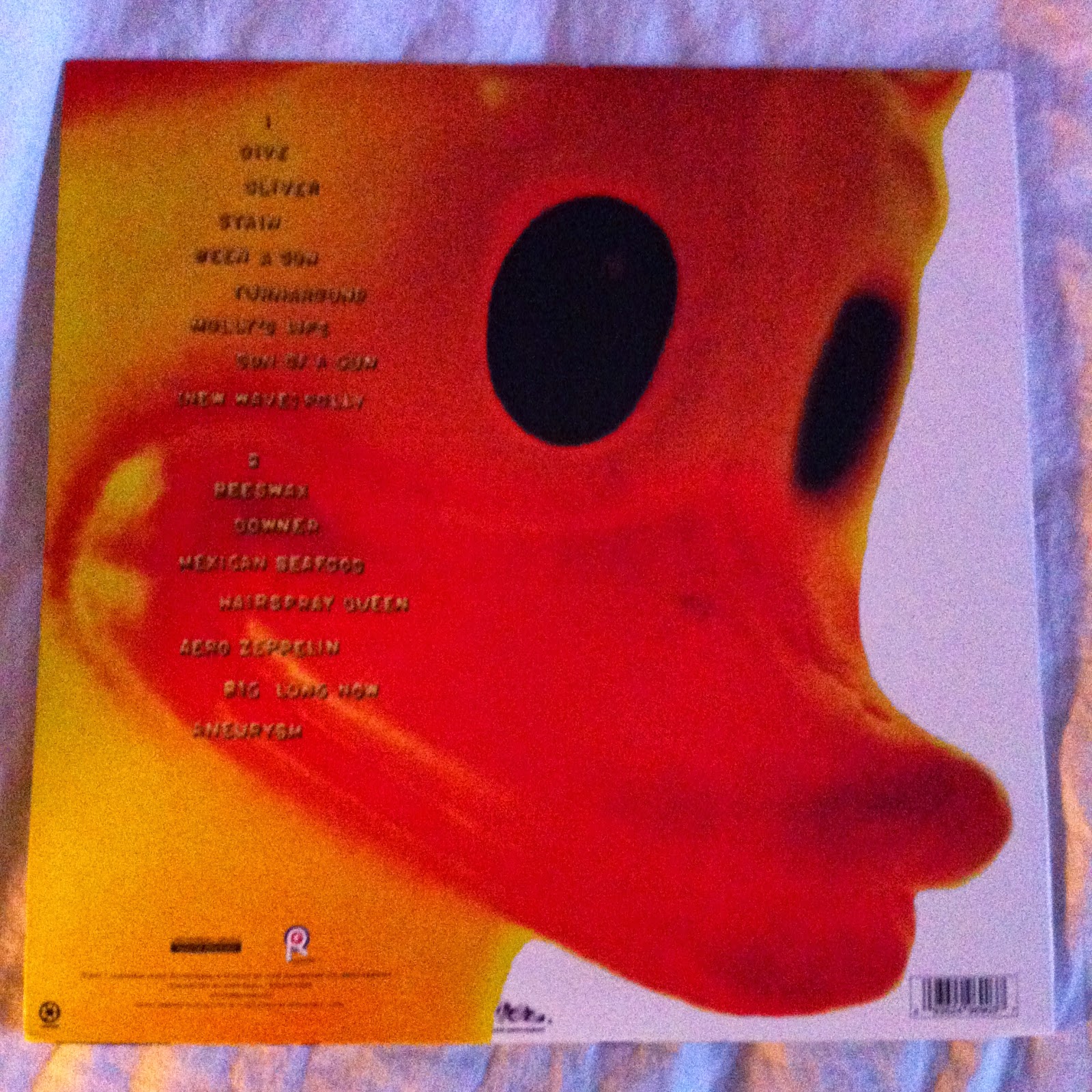
Side B // Back Cover. The J-Card is printed on both sides. The back outside panel has the track-listing and the inside has lyrics, personnel and credits. 
I bought this along with an End of a Year test press and Cursed 7'' from a guy on Facebook of all places. 


Blue was the 2nd press /30. Again, clear shells with stickered sides. This time however, the font on the stickers is slightly different and in lower case. The cassette shell is also slightly different, suggesting they were either made at different plants or dubbed in house using whatever was available? Either way, it's cool by me. 


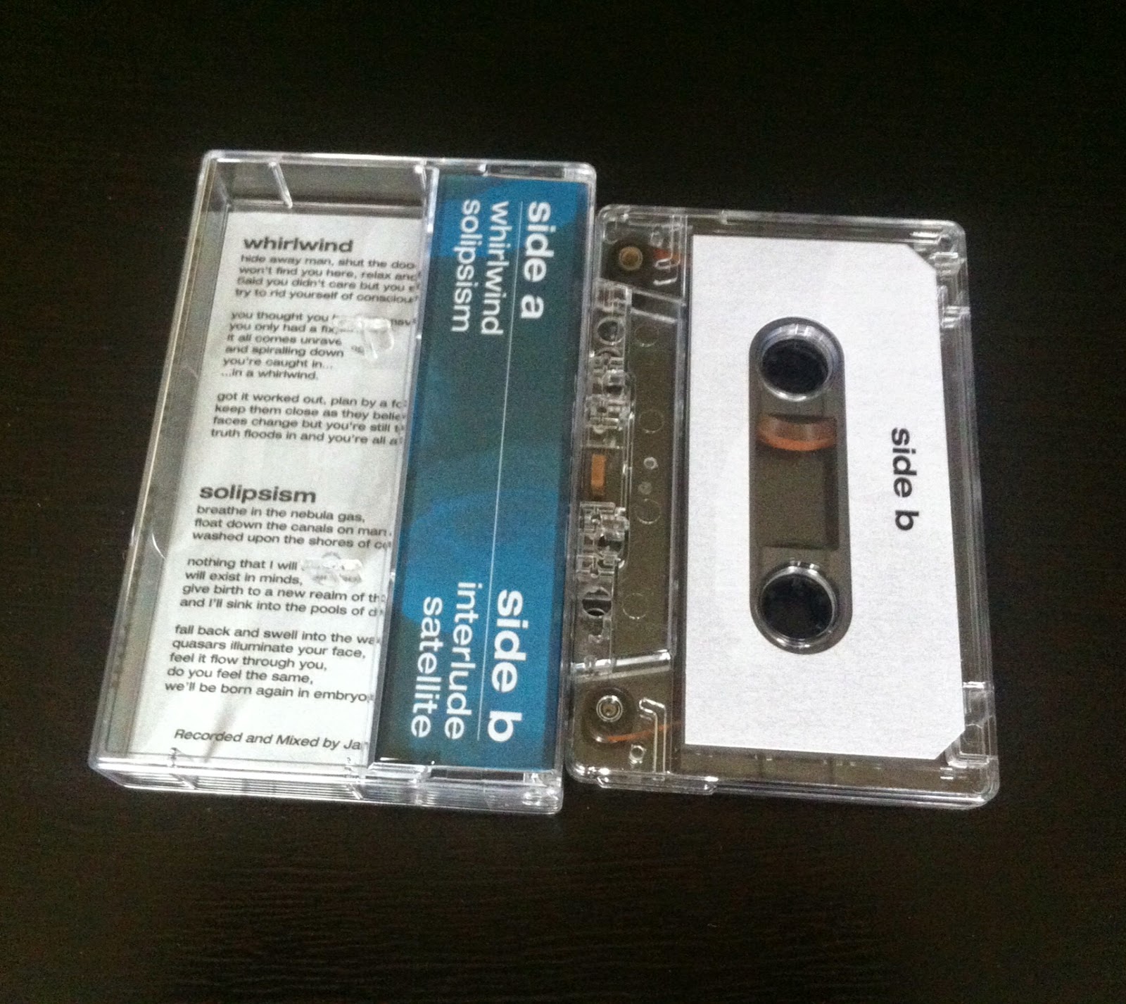
Side B // Back Cover. Not a terrible amount of difference here between the 3 pressings. The inside panel of the J-Card stays identical through the 3 pressings, so we'll get on to that a little later. 
Bought this from a label's Bigcartel. They were selling off personal tapes to fund a release, and this was in there so I figured I would grab it. 


Green was the 3rd and final press of this tape, and landed for sale some time in early December 2013 through the band's Bigcartel. I got into the band a couple of months before and there was no physical copy of this around at the time; so when this went up for sale I made sure to get a copy early. Similar stickered sides as the 2nd press, however I think the cover art is printed under the text, it's super faint though. The tape mechanism is different for a 3rd time. 


Side B // Back Cover. 

I have been listening to this an awful lot over the past year or so, and with the demo up for pre-order on vinyl and their new 7'' up for pre-order too through Neutral Words Records I'm glad I made the jump early and grabbed up the tape variants. Although everything else is still at pre-order stage, I am up to date including tests of everything. I guess you can add this as band number 4 that I am now a full variant geek for. I really hope these guys don't end up creeping over to a US label any time soon, trying to negotiate test presses and postage costs across the pond is a real drag at times. 


When the 3rd press arrived through the door, it came with this note. I write for a blog weekly (jivetalk.co.uk) and I did a post on Fade that someone must've caught of which is cool; suppose it means someone is taking notice somewhere down the line. 


Inside of the J-Card. I like the lettering printed over a faded version of the cover, it's the same on all pressings and is just a little more thought out than most demo tapes. Plus, I'm a sucker for changing covers as opposed to variants etc. for some things. Anyone remember the label colour change on 'The Sun Isn't Getting Any Brighter'? It started off the idea (for me) that changing variants can go way beyond the norm of changing a shell or record colour. More realistically, this way is probably cheaper too. 


And finally; group shot. I hope I can keep this collection up. I'll keep you all posted. 

Cheers!


Monday 27 October 2014

Pallas Incesticide

Nirvana are one of those bands that I will forever love unconditionally, which is funny in a way. I spent most of my youth completely detesting this band. I grew up in a small town with a small town mindset, and for a while you couldn't move for kids in oversized Nirvana hoodies, all talking about how sweet that Teen Spirit thingy song was. So I chose the high road and dismissed this band outright. Only in my mid teens when a friend bought me In Utero was I really turned on to how incredible this band was. Since then I haven't looked back for a second. 


Nirvana - Incesticide - DGC/ ORG Music - 2011 Re-press - /? 

As with most Nirvana records. Most of the pressing information is pretty difficult to track down, so I'll not spend too much time dwelling on that. 


Back Cover // B-Side. This copy came out in 2011 and was pressed by Pallas in Germany. The vinyl is pressed on 180 gram audiophile grade wax, and sounds absolutely incredible. My turntable probably doesn't do it justice. Not to say that I have a Crosley all in one or anything, but this record would probably lend itself to an audiophile set up. It still sounds perfect to me either way. Bernie Grundman Mastering also handled all the mastering for this re-press, and it was all done from the original analog tapes. 


Due to the awful lighting on these photos, we're going to go through things one by one, starting with the cover art. The cover art was painted by Kurt Cobain, credited Kurdt Kobain in the inner sleeve. I'm not sure who handled the typeface or band logo. 


Back Cover // Track-listing. Again, these photos came out really terrible and so everything is a little hard to read. Below the track-listing there is an ORG Music label too, as they handled the re-press and distribution for this. They also re-issued In Utero a couple years prior to this. I had that copy until a year or two back when I traded it for an early press with good guy Alan Beningfield. The layout for both re-presses is pretty much the same, and come with largely the same extras. 
Oh, apparently this rubber duck also belonged to Cobain. I did some reading up on this album, and ended up trawling through page after page of Nirvana nerd fan pages. Is there any way to really prove or disprove that this was his? Either way, cool story bro. 


On to the insert. This is such a great photograph, and I have no clue what guitar he is using here. I bet it sounded exactly as it should. The text is a letter of sorts from Cobain (signed Kurdt - The Blond one) and it deals with quite a few fairly hairy issues. Most notably there is an open address to homophobic, sexist and racist fans asking them to leave the band the fuck alone; to not attend their shows and to not buy their records. Also, there is a paragraph that deals with the sexual attack of a girl at the hands of two males singing a Nirvana song whilst raping her. These are some fairly heavy topics, and it's cool to see that these were out there in everyone's face, for everyone to pay attention to. Below that is a list of thanks. 


On the other side of the insert are the credits. Six people are photographed here. The first 3 images are of the most memorable Nirvana lineup, and the others are the previous drummers that featured on these recordings. This is essentially a compilation of 3-4 years of recordings that featured an unstable lineup. It's cool that everyone is credited, and it kind of helps to piece together where these songs fell in to place. 


Something that was also in the In Utero ORG Press I had is this postcard, advertising the Nirvana albums that had been remastered and re-issued from ORG. Completely useless and you wouldn't even think about using it, but I guess it's something to sit in the sleeve and be kind of inoffensive. 


Centre labels. Kurt is credited as Kobain as opposed to Cobain on this recording, but considering through the various spellings of his name through the Nirvana catalogue it's nothing too surprising now. 
These were photographed as they include some information as to the inclusion of so many labels within the release of this record, and it's easier to show that than it is to try and explain it.


Finally; a sticker on the poly sleeve including some information on the release. Again, the ORG In Utero had a similar sticker. 

I got this version for my birthday a few weeks back. It came sealed (in one of those poly sleeves that you have to rip the top off to get in to, Southern Lord sometimes use them?) and didn't stay that way for long. As I am picking Nirvana stuff up as and when I see it, it turns out that the only full length I am still yet to own on vinyl is Nevermind. Is it just me that thinks that is a little backwards? Probably should pick that up. 

Cheers!


Sunday 26 October 2014

It's the Floor I'm Reaching For

I've had this record a little while now, and it's a great one so I guess I should get writing. Also, a bit of a funny/ kind of annoying and not so funny story about this one too, but more of that a little bit later. 


Prawn - Kingfisher - Topshelf Records - 1st Press - Orange / Bronze ASide BSide /900. 

This was the most common colour for the 1st press and I bought this through a seller on Amazon. I purchased this with an Amazon voucher I got a couple months back for my birthday. I was a bit unsure of what to buy, and after hearing good things, liking the artwork and trusting the vast majority of what Topshelf works with I decided this could be a good shout. 


Back Cover / B-Side. 

I do like a variant where the A Side and B Side are different from one another in colour. This LP is already in to it's 2nd press now, and the one colour of that press has tackled a similar idea but with Electric Blue and Bone. However, this colour perfectly sums up this record for me. The artwork and overall sound is very autumnal. This LP really clicked for me a week or so back when I was biking through some woods a few miles from my house, and probably goes some way to explaining why I've been holding off on this. 


This copy came in one of those Japanese style sealing poly-sleeves that I always treat with caution as they have the potential to take a chunk of artwork in the adhesive seal. More to the point though, it came with a sticker from VICE / Noisey on the poly-sleeve. I don't get the problem people have with VICE Media; they come out with some utter balls and they occasionally get things pretty on point. Just like most journalist media? At least Noisey push some cool bands and do something interesting from time to time right? 


On to the inside of the gate-fold (oh yes, sorry it comes in a gate-fold sleeve with a real thick spine. The whole thing feels remarkably sturdy). All of the artwork for this record was handled by Charlie Wagers, who has done some great art for David Bazan and Mewithoutyou among many others. This art is no exception, it's wonderful. 


Close up of some of the inside art. Completely fluent and brilliant concept.


However, something that's kind of cool but also not so cool at the same time. I ended up with another copy on my birthday. Only problem was, I really wasn't supposed to end up with another copy of this. 
In short, Silver Bullet fucked up pretty big. 


So, I was supposed to end up with a copy of the new Empire! Empire! (I Was a Lonely Estate) LP from Silver Bullet, on Black vinyl courtesy of my wife for my birthday. Instead, this turned up after already being a couple of weeks late. They got the colour right at least I suppose? After a couple of emails back and forward to the Silver Bullet store and after hearing some other issues they had been having, I decided to email Topshelf directly and get an answer as to what was going on. Long story short, Seth over at Topshelf is a complete dude and is sorting out a problem that was completely out of his hands. I should be getting a copy of the new E!E! any day now and I'll keep you posted. 


Money shot. Well kind of. There's another couple of variants of this out there. I'll grab them if I stumble across them.


Thursday 23 October 2014

Code Orange Kids / Code Orange / Code?

Well this album certainly sneaked up and surprised me. 
I wasn't planning on buying this album at all. I had bought pretty much everything the band had done up to this point, and whilst some of it was kind of forgettable, it was enjoyable all the same. But I thought that I had pretty much all I needed from this band for the time being, so if I ever felt the need I would probably just pick it up as and when. 

The the Thinners of the Herd email thread started... 


We're going to go through a little bit here I would imagine, I'm pretty enthusiastic about this record. But straight off the bat this album art needs talking about. This is some of the ugliest cover art I have ever laid eyes on. I've never been huge on Code Orange (Kids) artwork, but damn this just really takes the piss. I almost like it, but everything in my body tells me not to. 

Code Orange - I Am King - Deathwish inc. - 1st press - Opaque Green /6360


Back Cover // B-Side. The centre labels for the record are pretty on point.This logo started popping up along with the 'Thinners of the Herd' thing. The Black/ White/ Green artwork matched all the variants quite well from what I have heard, so I wasn't overly fussed on what colour I ended up with. This will do me just fine. Alternating colour schemes on the track-list too; fairly neat little touch. Tiny Deathwish logo on the bottom centre of the sleeve too. 


The sleeve is a fairly high gloss gatefold. Also, the spine is fairly thick, and with the stark White and Green lettering, it really does help this record stand out on the shelf. Probably explains why I'm pulling this out on every quick glance.


Inside the gatefold. Now this is probably the art I can get behind way more on this LP. There's something about this photo set that just seems a little closer to what the record is actually all about. Again, the stark colour-less imagery is what I'm really digging here. This album sounds like it was recorded in black and white. I know that's a really stupid analogy. But this record sounds like all the colour has been drained from it. Not that it lacks vibrancy, it's just a feeling I get about it. 


Printed insert. I mean, I'm expecting it to seam split before too long, but for now it's pretty intact so I'm going to enjoy that whilst it lasts. Carrying on with the same colour scheme all the way through, with some additional art here. King -- Crown, see what they did there? Clever right? All of the art and design was handled by Kimi Hanauer from Pittsburgh. I was introduced to her work through a Run For Cover Records video series called 'Off the Radar'. She also plays in Adventures, and they also feature members from Code Orange. There's the connection. 


Finally, the other side of the inner sleeve. All of the layout was handled by Jami of Code Orange. Also, Kurt Ballou recorded this at God City, and he's churned out a few great albums this year (new Every Time I Die was a complete party crasher). 
So a few things on why this album has got me so enthused: 

Code Orange changed their name just because they wanted everyone to know that they're going to do whatever they want to do. I heard that from a Deathwish Podcast hosted by Pat Kindlon of Self Defense Family fame. I thought that was fairly poignant, considering the lyrical content of the LP. 

The album is absolutely crushing in a way most heavy records just aren't. Even the quiet or softer parts of the album hold the same impact. Considering it's fairly diverse in a musical sense; there are no real lulls or skipped tracks. 

They made a few really potentially cheesy moves in this album coming out. Started a mailing list, called an album 'I am King', changed the name for no particular reason. But in spite of that, it was all so full of absolute integrity that it didn't feel cheesy at all. 

The art is still awful.  

NO BOXES . NO BOUNDARIES . NO FEAR


Saturday 18 October 2014

Downward Years Part 2.

I said it. I knew I would end up buying another copy of this record. But, on the upside it has new artwork and bonus tracks. It didn't take a lot of me convincing myself to buy this record, and the bonus tracks are perfect. Having an acoustic version of Suns and Lovers is really worth the asking price alone. 


So here it is! My second copy of Downward Years to Come. There's some reversed artwork going on to help differentiate between the presses, and the contrast is great. 


Nothing - Downward Years to Come v.2.0 - A389 Records - 2nd Press /? 

As is the way with the 1st press, finding any pressing information on this record isn't exactly easy. I ordered mine from Rich over at Ignite Records and ended up with a black copy. On the A389 store, two variants are sold out and two variants remain available. The black is one of two available colours; whether this is down to it being the most common colour, or whether people just don't buy black when a colour option is available? I don't really mind either way. 


Back Cover // B-Side. Pretty much the same layout on here as the 1st press, only with the amended speed (the first press indicates 45rpm but it is played at 33, as is this re-press). Also, the extra tracks are added to the track-listing and the colours schemes are reversed. 


First side of the insert. Again the colours are reversed and it's all cool. I was expecting some hick move like inverting the cross. Glad that didn't happen. 


Again, the colour scheme of this side is reversed from the original press too. Additional thanks, credits and lyrics are here too. It's pretty nice attention to detail to amend the insert. Also, black text on a white background is much easier on the eyes, so I'm always a fan. 


This press also comes with a sticker with a little extra information. It was on the cellophane of the record, but I'm particular and peeled it off and attached it to a dust sleeve. Also, the barcode of the release sits on this sticker as opposed to ruining any of the artwork on the sleeve. So everyone is a winnder right? 


Finally, a quick comparison of the two! Even the colours on the centre label are reversed, so impressive. I would love to pick up more variants of Nothing records, but at this point it would be such a rabbit hole to fall down. For now though, I'm more than happy with these two. 


Friday 17 October 2014

Pianos Beercome the Teeth

Pianos Become the Teeth are a band that I have loved since I first heard them. I'll happily pick up a record by this band without streaming anything first. Yes I know they've gone soft; still think it's going to be a great LP. Whilst I don't actively seek out variants from this band, I probably have a couple colours of each release. Well, except this one as it was only pressed on one colour. 


Pianos Become the Teeth // Ezra Joyce - Split - Bear Records - 1st Press - Beer /500

I mean, how has this never had a repress? Whilst I'm here, why has Saltwater never seen a vinyl press? Why has the re-recording of Houses We Die In never seen a physical release? So many questions. The cover art here is quite odd, and we'll get into it in a little more depth somewhere down the road. 


Back Cover // B-Side. As you can see, both centre labels are blank on this record. I'm not sure if test presses were made for this release. I would hope so, giving that the PBTT side is really long and could sound super sketchy. But the plain labels are normally reserved for low budget releases that haven't been test approved. I'm not sure, I like the colour and I would rather have plain labels than dodgy, cheap printed ones. 


Here is the artwork in full. The art folds in half, and kind of works in both halves separately. Danielle Yurchinkonis did the cover illustration, and also handled shared art and design work on Pianos Become the Teeth's 'Old Pride' LP, which still stands as some of my favourite cover art. 


This is the inside of the sleeve, which kind of doubles as the insert. There was no insert (or dust cover...) with this 7'', but the sleeve is double printed and you get all the information you need to know here. Looking at the PBTT line-up, it could be possible that Kyle is the only original member left now? This was released in 2008. Damn, that seems like so long ago! 

So is this the best PBTT material you will ever hear? Unless you have very peculiar taste, I can nearly guarantee you this is at the weaker spectrum of their recorded output. However, it's pretty hard to come by nowadays and it's definitely a cool record. Being honest, I listened to the Ezra Joyce side once; it didn't grab me and I never went back. I picked this up about 3 or so years ago, directly from the Bear Records store. Now it's long out of print and I would imagine Discogs to be your best bet if you happen to be after one?


Thursday 16 October 2014

I Just Wasn't Made For These Times

I've already waxed lyrical on this blog about how much I love the band Warm Thoughts (formerly known as Dad Punchers), but I'm going to go ahead and do it again. I sometimes feel a little alienated on this blog. Other record nerd blogs are looking towards seeking out OG War Zone 7''s, Wishingwell presses of Break Down the Walls and all the rest of it. Whilst I love that aspect of collecting old school hardcore gems, it just isn't for me as that stuff goes for what I would consider crazy money. So here we are today, writing about a 7'' that came out a year or so ago. I was missing a colour, now I'm not. 4 variants in and around £30 spent. Not too bad. 


So I'm just going to dive straight into the variants, and we'll chat about the good stuff a little later on. 
Quick catch up: Dad Punchers (Warm Thoughts) is Elliot Babin of Touche Amore fame, and a revolving host of guest musicians for tour. This record was released through Jeremy Bolm's (Touche Amore vocalist) label, Secret Voice. Oh, and Nick Steinhardt did the design. And Clayton who plays guitar in Touche Amore handles live bass duties for Dad Punchers. It's all a family affair right? 

This was the only colour I was missing, and scored it from a seller on Deadformat. Buying on DF is becoming few and far between for me, so this was a nice experience. 

Dad Punchers - These Times Weren't Made For You - Secret Voice - 1st Press - Milky Clear /200


The other three colours of this I got at distro from Dog Knights Productions here in the UK, so I saved a bunch on shipping and got to buy records from a great label and distro. Also, you can tell this is Secret Voice a mile off from the design of the centre label. 

Dad Punchers - These Times Weren't Made For You - Secret Voice - 1st Press - Aqua Blue /300


And this is the most common colour of the 1st press. Also, this is probably the one I grab more than most when it comes to spinning this 7''. I think the colours work well together, and I've probably had this one the longest. 

Dad Punchers - These Times Weren't Made For You - Secret Voice - 1st Press - Coke Bottle Green /500. 

This makes the 1st press total of 1000. The 1st press of the Dad Punchers LP was also 1000, so points on consistency I suppose? Also, I have taken photos of both the A and B labels in these photos if you look closely.


This record did a fairly good job of selling out quickly. It wasn't long after the 1st press was out physically that it started to disappear from the Deathwish estore (where Secret Voice set up shop), and then distro copies were soon being snatched up. So this 2nd press was made up, and this is the colour still available. I do like it when a 2nd press comes out in a singular colour. I love variant collecting; but it can be defeating to shell out on another 3 copies of a release, barely a month or two past the 1st press coming out. 

Dad Punchers - These Times Weren't Made For You - Secret Voice - 2nd Press - White /1000


So here we are, on to the story and design of this record. 

The record is 4 tracks long, and was recorded during downtime between Touche Amore tours. The whole approach to the release feels very DIY. Most of the instrumentation was performed by Elliot Babin. All of the recording was handled by Elliot too, in the living room of his father's house. Some lyrical content here deals with personal growth, and I suppose the whole approach encapsulated those themes too. It's pretty cool. I believe the title of the 7'' is loosely based on a Beach Boys song too. 

Nick Steinhardt handled the design and layout on this release, and is quite far removed from his normal scope of work. I like it all the same, and it shows that he's a diverse dude. That head perched on the sofa kind of reminds me of the Quicksand S/T too. 


Back Cover. All of the art and design is kept the same throughout the 2 pressings, and the back cover is quite minimal. You get what you need to though: A/B Side track-listing, barcode and label name.


On to the insert. Much the same with how Nick handled the S/T art and layout; we are treated to hand-written lyrics and thanks. On the LP however, the insert acts as a dust sleeve and that is not the case here. I'm happy about that mind; as glossy // printed dust sleeves on a 7'' can sometimes be a nightmare with static and stuff. 


Other side of the insert. These are the rest of the lyrics, thanks and credits. It's a cool little insert and I do like the fact that it's not typed; it works way better with the aesthetic of the release this way. 


Oh and finally. Money shot. 

Thanks for reading!