Wednesday 29 April 2015

Lashes To Ashes // Lust To Dust

I guess the secret was bound to come out at some time, and with my recent mail I guess it's time to sit down and have that conversation. I'm a huge HIM fan, and I mean really into them. My first tattoo was a Heartagram, I have a ton of merch and rare promo stuff, and now I also have an awesome box set to add to the collection. Hate if you want, but either way this is a really well put together box set that I'm really happy to own. 


There were two Box Sets available, one was a super deluxe deal with double LP's that came on coloured wax and the other was the standard bundle with single LP 180 gram Black vinyl. This time I settled for the latter; the super deluxe was way more money, and all the tracks are available here too. I'm not really needing audiophile quality of B-Sides and Live Sessions just yet. Plus, this version was available on Amazon and saved me a decent amount in shipping. 


As is the deal with most box sets, there comes a sticker detailing the contents inside. It's a shame this one is wrong and really the only real let down. There claimed to be a signed poster print of the artwork in here, which there isn't. I emailed the label and they said they'd try and sort something out, but that it was just a manufacturing error on the sticker. 


The box is also fairly deep, especially considering the contents. The title of the box runs down each side and it looks pretty great. The bottom of the box is a little scuffed from storage, but looking at the high gloss wrap on the box it's probably unavoidable. 

On to the records!


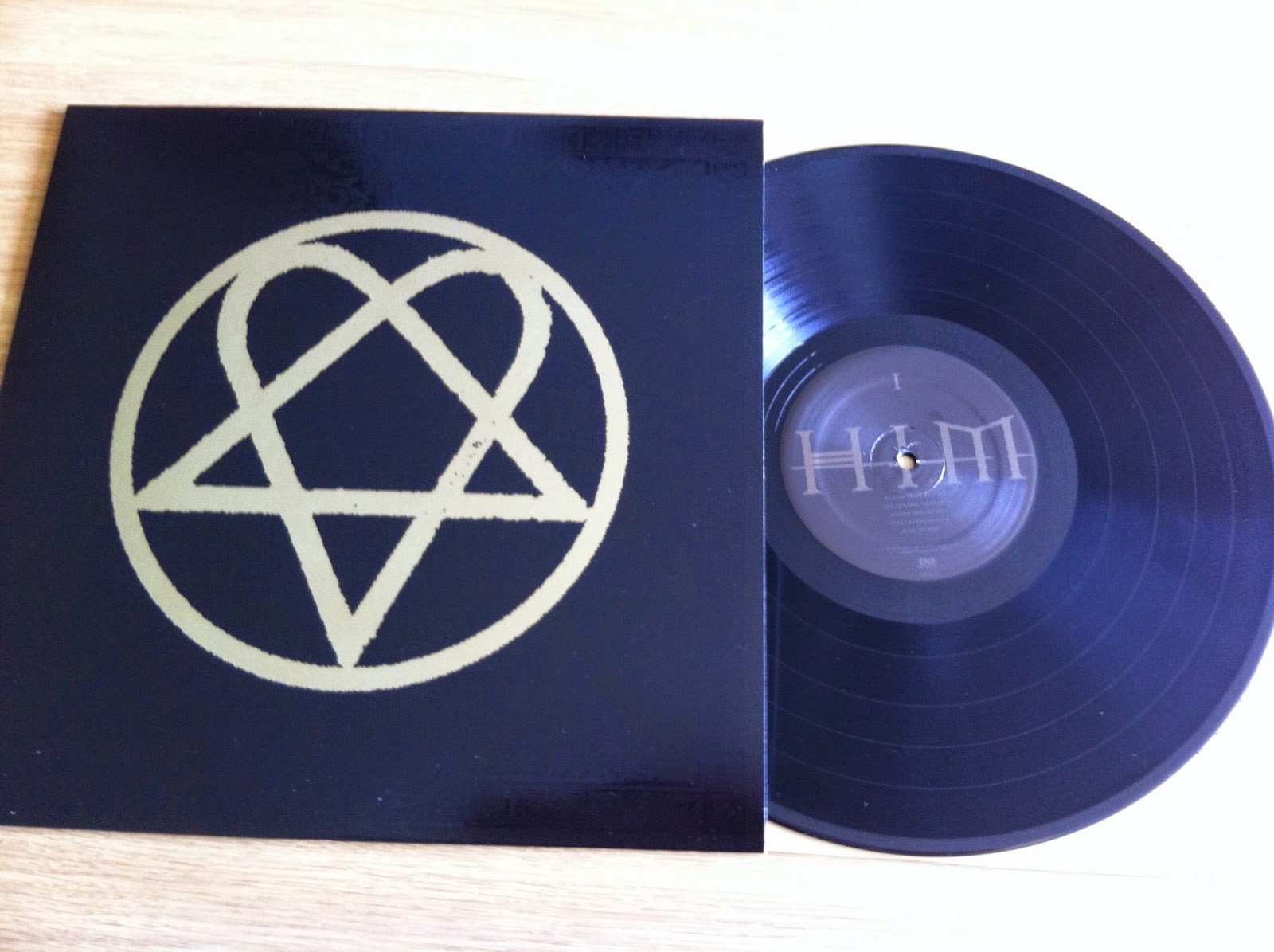
H.I.M - Greatest Lovesongs Vol. 666 - The End Records - 1st Press - Black /2000 (180 Gram) 

The box sets were limited to 2000 each. Also, I have only taken 1 or 2 photos per record this time around. Normally I like to show the insert and such, but 4 photos over 5 means 20 photos minimum on records alone. If anyone wants to see anything in particular just let me know? 


H.I.M - Razorblade Romance - The End Records - 1st Press - Black /2000 (180 Gram) 

Most of the time I'd refer to this as my favourite record from this band. It's weird that I've known this record for 12 years or so and there was definitely a point in my life that this record was getting listened to at least twice a day every day; yet I'm still not even remotely tired of it. 


H.I.M - Deep Shadows and Brilliant Highlights - The End Records - 1st Press - Black /2000 (180 Gram) 

All of the inner sleeves are printed on both sides, and come with extended liner notes and other cool bits. I only have two 12'' box sets in my collection, and neither have come with a large book or anything like that. I kind of feel I'm missing out on something in a sense. 


H.I.M - Love Metal - The End Records - 1st Press - Black /2000 (180 Gram Black) 

This box set was originally released as a way for US fans to get hold of their back catalogue, as HIM didn't really blow up over there 'til Dark Light came out. Over here it seemed to start with this one though. 


This is a quick close up of the cover just so you can see the spot UV finish on the sleeve. This is similar to the CD issue, but it looks far nicer blown up to true size. 


H.I.M - 666 Ways To Love: Prologue - The End Records - 1st Press - Black /2000 (180 Gram)

This was the final piece that made me take the jump with this box set, as I have never heard this record aside from a few sketchy sounding bootlegs here and there. Although The End were streaming this on their Youtube page early, I held off and listened to it this way.


Token slipmat. Normally I'd pass this kind of thing off as box set fodder, but it looks pretty neat so I'm definitely not complaining! I'll probably never use it, I keep an old No Idea one in rotation most of the time. I have a Touche Amore one that never gets used too... 


USB 

This was another great selling point for me. All of the bonus tracks on the LP's of the super deluxe edition of the other box set are stored here in this neat little USB stick. Then they can stay on your iTunes which is going to be the only place they'll get played after a token spin anyway. Again, this probably won't see the light of day again, and I'll definitely not wipe it and use it for anything else. Some stuff I'll only listen to now and then, a lot of it is either album worthy or at least worth a compilation release one day maybe? 


The bottom of the box. Here you see how the USB is stored in this little cutaway so it's not rattling around in the box or pressing on the sleeves (it's sunk in too so it's pretty flush with the box). The writing is simply crediting Samuli Heimonen as the cover artist for the painting 'Heartagram in Fur'. Now I know the signed art cards and 24'' X 24'' posters exist for it, I would love one. Again, it would stay in the box, but just to pull it out occasionally and really appreciate the art in full size would be enough. 


Finally 

Back of the box! 

I've loved every minute of writing this. It's well put together, it sounds great and doesn't really have any throwaway elements at all which I'm super chuffed about. Sorry if you think this band suck! I might do a post on my only other box set whilst waiting for RSD stuff to arrive. 

Cheers!


Tuesday 28 April 2015

Give Me More!

After relentlessly spinning the Give full length over the past month or two, I have decided to further delve into their catalogue and see what I have been missing out on. The easiest thing to find with a quick eBay search was their newest EP, so that's what I ended up with. 


Give - Sonic Bloom - Revelation Records - 1st Press - Yellow /700 

Although it would've made sense to go backwards and discover something from a little ways back, I couldn't resist this artwork. Kinya Masuo did a great job, creating all of this by hand with clay. Another big seller for this was the fact that it came out on Rev, and I'm making a little more of an effort to dig into the history of this incredible label. 


Back Cover // B-Side 

Revelation Records have their logo immortalised in clay, and it looks super neat. Another weird thing is how the barcode is half cropped in the top corner. The one thing I will say though is this fucking record has never been yellow. It's orange. 


Insert 

This is mostly made up of the clay models on the sleeve with a larger Rev logo in the centre. 


Insert 

It was super hard to photograph, hence that nasty flash kicking in the middle. From what I gather this was recorded at the same time as Electric Flower Circus, in the same studio and engineered by the same guy (Don Zientara), even including some of the same songs. The Crucial John clay model definitely cracks me up though... 


Finally, a Rev order form. I love that you can still do this with a record label, although I wouldn't particularly use it being outside of the US. 

Cheers!


Sunday 26 April 2015

RSD '15 pt. 2

This week I have been making a dent in my RSD wants list online, so this stream of posts will continue in the coming weeks as this stuff arrives. But for this one I'm going for another item I picked up on the day... 


Frnkiero Andthe Cellabration - Live At BBC Maida Vale - Hassle Records - 1st Press - Mint /500 (RSD '15 Exclusive). 

The immediate thing I noticed about this record, even when it was still sealed is how bright this record is. From the variant to the cover art and the insert; it's all very colourful. 


Back Cover // B-Side 

The Maida // Vale labels are a neat touch, and this variant is incredible. It doesn't photograph up too well, but in person it's a real treat. 

I'm a big fan of BBC live recordings; from the old school approach of Peel bootlegs it's always been a great look in at a band from a live setting. Another obvious example of the importance of these sessions are the two Touche Amore 7''s. At first I thought these recordings sounded a little thin on the ground, but with a few listens I'm definitely sinking into how these songs come across. Again, this feels like something that should come out on Record Store Day as it's a pure celebration of live music and music overall. 


The sleeve came stickered, but not with the typical RSD design that we saw on my previous post. This is just as cool though right? Frank Iero made a small statement about this record that was on the RSD site, and I kind of wish that made it on to the insert. The insert itself is pretty hard on the eyes so I've left it out this time round. The important stuff to know is that it was recorded at Maida Vale by Daniel P. Carter. 

Cheers!


Tuesday 21 April 2015

RSD '15 pt. 1

Okay so everyone loves to have a moan about this day. Obviously, the big moan this year was Deja Entendu (1 store in the UK, 13 copies in the UK, just about double the price in the one UK store than it was in the US) but this year it was all about adjusting expectations for me. I wasn't paying that much for a record with a standard press on the way, and so I resigned myself to the fact that I wasn't ending up with it on the day. In the end I hit up two local stores, picked up three items and cut in at under £30. It was more about spending some time with some good mates, driving around and finishing off the morning with some breakfast. What I want I can pick up in the coming months when prices calm down and what I don't end up with I don't end up with. It's all cool. 
One of my main want this year I did manage to score though which is pretty cool; first item first store. I'll do a couple of posts on RSD so we'll go in order. 


Foo Fighters - Songs From The Laundry Room - Roswell Records - 1st Press - Black /1500 (RSD '15) 

I think the overall pressing number was 4000, with 1500 allocated to the UK and 2500 for the US. I believe the only difference in the two is the RSD sticker. 


The record comes in a Japanese style sealing sleeve, and once you wrestle your record out of that there is an almost J-Card style wrap around the sleeve. It's a really neat little design and proves that every now and then there is something truly worth getting on the day. This also came in at under £10 which is pretty reasonably priced in my book, considering another store near me was selling this for £17... 


The inside of the J-Card is printed up to look almost like a mix tape. The top left is the track listing with additional info such as the date of recording (all of these songs were recorded between '91 and '94 and all predate Kurt Cobain's Death. The rest of the info is credits and contact. 


Outside the J-Card. 

Everything here is pretty explanatory right? 


On to the record. The record comes out of the top of the sleeve as opposed to the side, and although it's hard to photograph the inner sleeve has doodles all over it that look pretty neat. I believe this was all on standard black, and it looks great and seems really well put together. 


Back Cover // B-Side 

The main seller for this was the 'Big Me' demo, but the Kids in America cover is surprisingly pretty great too. Who knew right? This seemed like a necessary release; not an unnecessary classic rock re-issue, not a naff exclusive b-side or remix. For me, this kind of encapsulates what Record Store Day should be about. 


Finally, Stickered Sleeve 

The stickers this year have been changed up a little I think? Always nice to see! 

Cheers!


Sunday 12 April 2015

Does It Matter?

So a band that is often featured on this blog is Touche Amore. That would be for two reasons: they are one of my favourite bands and secondly, I definitely have more Touche records in my collection than any other band. At the moment, I am about as complete on this band as I'm ever likely to get without throwing stupid money on test presses. But less dwelling on that, and a little more on the subject at hand; the Touche Amore // Self Defense Family Collaborative 7'' entitled Self Love. Long story short, both bands got in a room, all plugged in and wrote two songs. Will Yip recorded it, and the whole thing was done in a weekend if I remember right? As both bands contributed to both songs, it breaks the standard format of a split 7'', hence the collaborative tag we're throwing around today. 


Touche Amore // Self Defense Family - Self Love - Deathwish Inc. - First Press - Opaque Light Pink /300 

Both centre labels have text in a circle, and from what I can tell neither are related to the lyrical content of the respective song. This side has the track Circa 95 (you can see up top of the label, Deathwish logo at the bottom); and out of the two this seems to have a bit more of a TA vibe. The variant itself is pretty neat but doesn't photograph too well, as there are a few different shades of pink and a little white in here. This was the standard '1 Per Customer' pre-order colour from Deathwish and it sold super quick. 


Touche Amore // Self Defense Family - Self Love - Deathwish Inc. - First Press - Transparent range /726

As there are a few variants to get through, it makes sense to photograph the A side of some, the B side of the rest right? Saves looking over the same thing too much I guess? Centre labels are a different colour to one another, but more importantly all the information about the recording and the lyrical content is on the back here. No insert included. There are 15 people credited here (14 musicians plus Will Yip - Nick Steinhardt is also credited for Art Direction and Design). On the left is all the lyrics, down below is the Deathwish legal stuff and on the right is all credits and a bardcode.


Touche Amore // Self Defense Family - Self Love - Deathwish Inc. - First Press - Opaque Grey /5320 

I swear that Deathwish pressing numbers get weirder. I'm sure these will all fly over time, the Orange was out of stock for a while, but more must have crept back in when pre-orders went out. The cover art is cool, and Nick really went all out on this design (a little more on that later). There is a similar 'hands in' photo on the back, I'm not sure if it's the same photo or whether it's two sets over two photos but it's a pretty relevant idea I guess? If you can see through the 'disco-sleeve' you can see the inside of the cover is Orange. It's a thing done a little more often with TA stuff nowadays, but every release has something fun and quirky going on design wise. 


Touche Amore // Self Defense Family - Self Love - Deathwish Inc. - First Press - White /200 (Self Defense Family Tour Exclusive) 

I have to admit, I had no clue about this variant. I knew there would be a clear /200 (as that's not yet for sale I am assuming another box set will surface?) but this completely passed me by. Thankfully, the internet is full of great dudes willing to help. A quick Instagram conversation, and a Paypal payment later this was on it's way to me. It arrived super well packed, and the guy wouldn't accept a penny over the cost of the record + postage. So a big thanks to Lyrik for grabbing this for me, and the internet is a cool place once more. 


Design 

Here's the part where I show you all the cool stuff Nick did with this record. We kind of covered the cover art, but the poly sleeve is a whole other thing. The sleeves come printed on both sides and fit over the record to create the full artwork. You can see it best through the centre hole, but one side is printed opposite to the other (solid and wavy are the only ways to describe it really!) with the title in the bottom right. To help differentiate sides, the title is only printed on the A-side of the cover. These sleeves are pretty thick too, I just really hope they're not prone to splitting as they look incredible and complete the art. 


Finally, a poster and flyer set. The flyer came with my order, the poster came from Darren at Dog Knights because he is a swell guy. 

Cheers!


Saturday 11 April 2015

Feeling Supersonic

This is one of my favourite records of the year so far. I bought / photographed this ages ago but never got around to posting about it as I thought I'd have little to say on the matter. But even if I fall short a little on the words, maybe the enthusiasm will come across all the same. 


Adventures - Supersonic Home - Run For Cover Records - 1st Press - White W/ Light Blue Marble /1000

White W/ Blue Marble may be a bit of a stretch, as this thing is like 98% white. Maybe some copies of this variant came with a little more blue in it. I ordered this from All Your Music, and was kind of hoping for the Starburst variant but for there's always a little fun in blind buying records right? 


Back Cover // B-Side 

The font on this is a little hard to read from a distance I guess, but it looks great with the artwork and RFC mixing up the logo colours pulls everything together nicely. It's a shame I didn't take a photo of the spine as it sticks out like a sore thumb (you can kind of see a bright yellow sheen down the side of the LP, that's about right; at least I have no trouble finding it!). 


Inside Gatefold 

This record comes in a nice thick gatefold sleeve, and on the inside is more artwork by Kimi Hanauer. Kimi plays keyboard and sings in Adventures, and was also semi responsible for the art and layout for the Pity Sex // Adventures split. I'm really not too sure on  the theme for this album art, but the little dude in a boat is quite a cool thing. There's a nice Adventures longsleeve on the RFC webstore that I'm tempted to grab, and this guy is on the back. Before I heard the record, I really wasn't feeling the art at all; but after some time to see how both fit together, I've warmed to it a lot. 


Insert 

Handwritten lyrics in inserts will always grab my attention more so than printed ones, although they can be a little harder on the eyes at times. It seems a little strange having a nice gatefold sleeve and an insert too, but using all the available space for art  must be a cool thing for anyone working with design and layout. For every RFC release I buy, I am never let down by what is going on; even if it's nothing particularly out there. They just seem to be getting it right if you know what I mean? 


Insert 

This side of the insert houses the rest of the lyrics, band personnel, thanks and credits. Alongside all of this you also get a band photo and some more art from Hanauer.
Over 3000 of this LP were made over 3 variants for the 1st Press, which seems like a huge number but I really hope more and more people catch on to how incredible this band is. Although we're only a third of the way into the year (or thereabouts) I'm fairly confident this isn't going to leave my iPod or turntable any time soon. 

Next post is probably going to be a touche amore one, just as a heads up. Been waiting on something cool...
Cheers!


Friday 10 April 2015

Dog Knights Mail Day

Mail Day posts are fun right? So I'm going to do another one. This time it's about one of the best labels around, and from one of the nicest dudes on the internet. Darren Harvey at Dog Knights Productions // Doge Knights has been putting out solid release after solid release fro years. I probably own a good 80% of whatever Darren puts his name to, and the other 20% I'm sure I'll catch up on before too long. Here is a quick snapshot into the last few records I bought from him. 


Old Gray - Do I Dare Disturb The Universe - Dog Knights Productions - 1st Press - Brown & White Mix /150 

I jumped on this record as soon as I knew the pre-order had gone up. Anyone who has hung with this label for a little while will remember when the An Autobiography preorder landed with the exclusive colour, and things got tense for a quick minute... 
This record has been put out in the US by Broken World Media and after a little to and fro, here the EU press stands. The other variant is a clear w/ brown and white splatter /350, but I'm a sucker for a nice mix. 


Back Cover // B-Side 

The B-Side has been screened with the artwork. Whilst I thought it looked great, I was talking to Darren and apparently the plant reversed the A and B side colour scheme, meaning the screen print was supposed to be on the side that had more of a white mix (the stock image on the bigcartel page shows this). This side also has a blank label to increase the visibility of the screen print. Again, for me this looks great so I'm definitely not complaining! The art is great, the colours match up well and it sounds way better for getting the vinyl treatment. 

There was no insert with this one, so on to the next release I guess? 


Simmer - Yellow Streak - Dog Knights Productions - 1st Press - Transparent Yellow /150 

The rest of the photos I took of this record got lost somewhere in my emails, and I deleted them from my phone when I was transferring them. But one photo is better than none right? There is also a transparent green /150, but Yellow Streak on Yellow just has a nicer ring to it right? 4 songs that show an awful lot of promise; if you like your shoegaze will a little more punch then you won't go far wrong here. 4 tracks cutting in somewhere around the 14 minute mark, and they're all true bangers. 


Disembarked - Nothing's Wrong Here - Dog Knights Productions - 1st Press - 180 Gram Black - /100 

This record was released too late in 2014 to call it on my AOTY list, but if I had a couple more weeks with it, there's no question it would have been in there. This record has pulled at me in a relentless way, and I can't stop listening. 


Back Cover // B-Side 

I love how the A/B labels take reference from the respective sides of the cover art. Up until this record came out, I had a full collection from this band and sadly I have fell behind when this LP came out. I'm definitely chasing up the other variants (and hopefully a test press) of this before too long. This band deserve to be absolutely huge off this LP. 


Full Album Art 

Rodrigo Almanegra has worked on a bunch of Dog Knights releases over the years, and this is definitely my favourite of his work so far. Thankfully, this art is wrapped up in a gatefold sleeve in order to see the full potential of the art. Another thing, this sleeve is super thick and sturdy, definitely worth every penny spent. 


Inside Art 

Lyrics on the left panel 
Thanks on the right 

Again, the gatefold packaging really helps gets this art across, and I hope this is a thing happening in more Dog Knights releases. Just as a point of reference on how hard working a dude Darren is, this was released in December of last year, and since then Dog Knights have put out 10 more records and a sampler. We're not even far in to April and he's already surpassed most label's of this size output in a year. 


And finally. A Dog Knights order just wouldn't be right without some stickers. As time goes by, the designs for these things just get weirder...


Thursday 9 April 2015

No Sleep Post Day

I know I haven't posted in a little while (sorry about that!), and as soon as this post is done I'm heading out on my bike to catch the tiny bit of semi decent weather we have going on here. On the upside though I'm going to run through a few records in one go. I recently made an order with No Sleep Records. I haven't bought directly from them in  a little while, but with the recent Shipping Innovation option they added to their webstore, I'm a little more inclined to give direct ordering another try. This bunch came in a couple weeks, which I thought was quite normal and they were packed great without any bumps or dings in the packaging. Great start! 


Have Mercy // Somos - Split - No Sleep Records - 1st Press - Grey & Red Marble /450 

First up is this great split, and the first release from Somos since moving over to No Sleep. Both bands follow a similar pattern of one full band song, one acoustic. I have a real soft spot for the Somos side of this record, but having never really listened to Have Mercy, I'm more inclined now to give their back catalogue a little more time too. 


Back Cover // B-Side 

With the colour way options available, I decided on this over the Clear w/ Green Haze as I recently picked up the Drug Church EP on a similar variant. It's a pretty neat variant and works with the art pretty well so I'm happy enough. 


Have Mercy Insert (Side 1) 

Kind of cut and dry here, so there's not too much to say. TJ Kelley did all the art on this split, and without quoting me, some of his work looks familiar to the Somos // Sorority Noise split that came out late last year. I could be totally wrong, but just a hunch... 


Somos Insert (Side 2)

Again, fairly cut and dry here so not an awful lot to say on the subject. I'm a big fan on how all the art seems to fit together well and how they've made the best of all the space available. Enough on this record though, on to the next! 


Touche Amore // La Dispute - Searching For A Pulse // The Worth Of The World - No Sleep Records - 5th press - Transparent Blue /1000 

If you want to know a bit more on this record, then divert your attention this way: 
http://23rotations.blogspot.co.uk/2014/12/searching-for-test-press.html

There's nothing to say on this record that I haven't said before. It's cool that it's on a different variant, and I'll always buy new presses but at this point if I said anything on the subject I would just be repeating myself. It was definitely this record going up for pre-order that led me to the No Sleep Store in the first place though. 


Various Artists - A Comp For Mom - No Sleep Records - 1st Press - Red /750 (924/1075) 

This is a benefit compilation released through No Sleep in memory of label owner Chris Hansen's late Mother. It's a great idea, and features some exclusive songs from some great bands either on the No Sleep roster, or affiliated with the label. 


Back Cover // B-Side 

Much like the Have Mercy split, this record comes with the printed dust sleeves which I'm a complete sucker for. I'm a big fan of this variant too, it's been a little while since I got a nice solid red LP. There was a Red w/ Cream Splatter too /250 and a friends press on Red W/ Clear Splatter /75. Aside from the test presses, this makes up the full pressing numbers. This wasn't included in the No Sleep Subscription series and is strictly limited to a one time pressing. 


A note about the record. 

Also, track 16 is a digital only cover from Touche Amore taking on Available by The National. But when you take into account the amount of great bands on this comp (Jon from Balance & Composure, Into It. Over It., Moose Blood, The Swellers just to name a few) there was no way I wasn't adding this to my cart on the way through. This record also came in a screened style cardboard jacket and these photos don't do it even a little justice. 


Finally, hand numbering.

Sorry it's been a while, hopefully this lengthy post will semi make up for it. 
Cheers!