Okay, so here is a quick preface to this guest entry. Richard Heaven has been reading this blog pretty much since I started writing it; has previously featured in it and even sold me records that have inevitably wound up on here. He's got far more of an artistic eye than me, definitely has better photography skills and has approached this from an angle that I wouldn't even have though of (despite owning the single LP press too myself). I am thankful for his input, and hopefully it will be one of many. Cheers dude!
I've wanted a repress copy of American Football's self titled album ever since it was announced but, for one reason or another, I never got round to picking one up. Still, things change, and recently I ended up buying the single LP repress from a facebook but/sell group. It arrived fine and sounded great but I soon realised that I wanted the expanded artwork and booklet that came with the double LP reissue. Well, as luck would have it, I was at a friend's house show a few days later and managed to buy his copy for a good price.
Records ei, they're like busses...
Anyway, I managed to sell my single LP version but before sending it out I offered to do a comparison post for my home boy Kane. Which brings us to here...
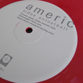
Working from the inside outwards, the first major change I noticed was the labels. The double LP repress featured a cleaner, airer design whilst the single LP labels felt very tight. The colours have been reversed although personally I feel like they both suit the variants.
Next up is the inner sleeves. As Kane has said before, the photos used in the newest pressing are perfect for the LP and really add something to the whole experience which is impressive considering that they were taken to work with imagery created fifteen years ago. The single LP version comes in a standard white paper sleeve which does very little for the overall package.
Now, I actually quite liked the lyric sheet on the older pressing. It doesn't hold a candle to the annotated photo book but it's printed on a nice textured stock and laid out very clearly.
And lastly we have the back cover. The contents have been shaken up a little to incorporate the additional LP leading the recording and pressing info to be relocated to the booklet. I actually prefer the layout of the single LP - although the red and yellow colour scheme suits the artwork I feel like the muted yellow and green text ties the two sides together more effectively.
So there we are, a brief side-by-side of the two represses. Both sound great and I don't think you'd regret buying either copy although I don't think you'll ever regret spending out a little more for the expanded package!


No comments:
Post a Comment