Showing posts with label Run For Cover. Show all posts

Sunday, 12 May 2019

Pinwheel Wicca Phase

As a precursor to the release of the new Wicca Phase Springs Eternal release 'Suffer On' (due out via Run For Cover records in February 2019 (I have preordered and hopefully i'll get around to posting about it); RFC also reissued previous LP 'Secret Boy' in August of this year. 


Wicca Phase Springs Eternal - Secret Boy - Run For Cover Records / Dark Medicine - 1st Press - Hot Pink / White Pinwheel /200 (RFC Store Exclusive Variant) 

This LP was originally released by Disposition Collective in 2016. The label also put out a WPSE 7'' and a split 7'' featuring Spur and Jake Clarke from Superheaven in 2017. But since then they have become quiet/ inactive sadly. 


This pinwheel variant is pretty stunning and definitely the best example of this kind of colour split I own. The new album comes on a black/ gold version of this pinwheel effect too. 


Single sheet insert with all the production credits listed and a photo on the reverse that you can see below. 


This record flows way better than I remember it doing before I bought a  physical version. I let the first press really pass me by, probably because ordering overseas is a massive hassle nowadays. Plus the physical bonus track (See You as a Dove) is probably the bet thing here. Either way, I'm glad that Run For Cover have a UK Store and I'm really intrigued to hear what Will Yip's production can add to this type of music. 


Saturday, 7 October 2017

Red Pleasure

Following seeing Citizen on their short UK/ Euro run earlier this week, I was massively feeling the hype for the new record. Today I got ahold of my pre-order for the new record (As You Please), and before it even hit my turntable I grabbed a few quick photos to make a post. 

A couple of things: I'm in the middle of redecorating my house, so places to photograph are becoming limited, especially being in Grey British weather. Also, this is one of seemingly a million backlogged posts; they're not coming in order of what arrived when, but they're definitely coming! 


I pre-ordered the Deluxe Box Set LP. As the variant is exclusive to the box set and is /500, I'm going to assume that the whole package is limited to this number. The box is pretty chunky and feels super sturdy, with foil stamped front and sides. 


The side of the box also has the label Catalogue Number too (RFC162). 


As part of the contents for this box, you get a massive (A1) poster that hasn't photographed too well but looks great in person. I'm not normally one for separating stuff from their sets, but I'm pretty tempted to frame this. The only immediate downside here, is that this poster is a trade in for the regular poster that comes with the standard copy (from photos I've seen it may have a Cheetah on it). This means that the LP is missing the poster, and there's also no insert/ lyric sheet. Not the biggest problem, but it would've been a welcome addition. 


Next up are the pin and dice set. The dice come in a bag, and the pin comes with a locking back which I'm a fan of. Being a sucker for a good pin made this box set all the more appealing (as did the dice but I'm really not sure why). 


This is the mixtape (the shell appears to be clear red but I haven't removed it from it's cellophane yet). It apparently contains remixes and other 'curiosities'; not a clue what that means but I'll have to wait for my new cassette deck to arrive before finding out. The pin and cassette are fastened to this cream background with the AYP Star logos in red. The cassette fastened by a light adhesive that should peel off without any damage, and the pin is fastened through the card which is cool as it kept it from getting thrown around too much in transit. Plus it looks nice and packs out the box a little more. 


Finally, this is the full set (minus poster) laid out. The variant is described as Red/ White Mix Swirl and as I said before is /500 and exclusive to the box set. I didn't photograph the B-Side, but it's mainly white with a small red streak running through. 

All in all I'm really enjoying this package, and the album is truly stunning. It's sold out on the main RFC store, but there may be a couple copies left on the UK one. I'd jump on it quick though! 


Tuesday, 18 August 2015

Big Scary Horses

Pale Horses by Mewithoutyou is without doubt one of my favourite releases of 2015. Not only because the music is great (which it really is), but as a package this record is pretty special. It's strange to think that there is a deluxe version out there that looks cooler than this...


Mewithoutyou - Pale Horses - Run For Cover // Big Scary Monsters - 1st Press - Clear w/ Purple and Blue Splatter /300 (Banquet Records Exclusive) 

In order to get all of this in, it's easier to photograph it all almost section by section. BSM did a three colour press of numbers totalling 1000, broken down as 200/300/500. Run For Cover pressed a total of 6000 units over 4 variants. MwY also released a double LP deluxe edition with two variants /? I kind of forget how big this band is; and really is shouldn't surprise me because they're great. 


All of the Pale Horses art (all of Mewithoutyou's album art in fact) comes from Vasily Kafanov. I first became familiar with his work when he did the album art for Machina: The Machines Of God by Smashing Pumpkins. Much the same as that LP; there is the main cover art and then a set of illustrations that follow the record, providing visual accompaniment to each track. A similar concept appeared on MwY's previous LP, Ten Stories. 


Back Cover 

Kind of minimalist in comparison, but the working titles scratched out and replaced by the printed titles is a pretty neat thing to do. Also here you get to see that a bonus track (Chapelcross Towns) was added for the UK press. This appears on the deluxe but isn't present on the RFC version. That also means that there is a minimum of three tests made for this record, without thinking about rejected tests and such... I think for once I'm more than happy to settle on one variant! 


Stickered Sleeve 

This record arrived in shrink with a sticker affixed to the shrink. I managed to get the sticker free and stick it on a poly sleeve, and if I hadn't done that I may not have noticed that the sleeve for this record is a little taller than your average dimensions. Also, aside from the height issue; the sleeve is super thick. Probably the thickest sleeve I have seen; such a high quality production all around. 


Next up are a few photos from the inlay booklet. This may have also been used in the CD press, or it may have been made up in place of an insert to accommodate the extra art from Kafanov. It's incredible to think that this was all created with ink and paper; the art here is truly magical and captivating. There's subtle detail in each illustration and it's all perfect! 


More of the art. There is some rumour that this was created in 1978, and some sources state it was as recent as 2015. I'm thinking that it's pretty new, but I've been wrong before!


This is how it's all laid out: illustration, title and lyrics. 


List of thanks, including companies used by// endorsed by the band. Also, tour buds are given a thanks here which is cool right? 


The record is housed in a printed inner sleeve too. Kafanov art all over, with one side cut to see the centre label and one side solid. 


The bit about this side that really gets me is the working titles in the top left. Xmas Cards For The Mentally Ill would've been a winner for me, purely for The Smiths reference. 

I'm a total sucker for this record, and this variant looks beautiful next to the art. The packaging is incredibly well thought out, and it's another victory for a cool UK label, what's not to love? 

Cheers!


Sunday, 31 May 2015

Lo-Fi Belongings

I remember this record going up for pre-order. I remember really wanting this record. I remember the pressing numbers stating 1000 on black as the single press. I remember thinking that 1000 was a crazy number and I could get it whenever, completely not realising that this band are kind of a big deal and it sold out fairly quickly.


Tigers Jaw - Belongs To The Dead - Run For Cover Records - 1st Press - Black /1000 

I have been searching for this record for a couple of years, pretty much since it came out and I missed out on it. Distro was a little less liberal then too so I managed to skip on the album entirely. 


Back Cover // B-Side 

Originally this was released on Summersteps records as a CDr as part of their 'handmade' collection. It came out in 2006 and is quite a far cry from the S/T LP that came soon after. This record has an incredibly lo-fi production to it, and is closer to the 'I'm On Your Side' LP than anything else in their back catalogue. 
This was re-issued alongside a 2008 tour EP from RFC. Again, originally that was a CDr only deal. I actually bought that at Pre-order, without picking this up. I'm an idiot. I really like the fact that this got a little remastering job for vinyl, and that the sleeve art is completely different. As much as the art on the Summersteps version has charm, I'm definitely a fan of this more so. 


Insert

This side holds all the lyrics. Hearing early version of Jet Alone and The Sun are really charming. I love having the lyrics here just as a comparison. The Sun in particular is radically different between each recording. 


Insert 

I love that Brianna handled the layout here. Although she wasn't in Tigers Jaw at the time of the original release, it's cool to see that something was contributed to this LP at some point. 

A little word on how I got this. I lurked through distro after distro after distro for about 2 hours before I came across a copy. A few emails later, and this was on it's way and it arrived in great shape and time. Who says you need to go a store to get that rush of digging... 

Cheers!

Friday, 22 May 2015

Cut My Brain Into Hemispheres

The amount of great records coming out this year is honestly baffling me, and I often find myself a few weeks behind new releases, desperately playing catch up. Here is a perfect example, and as a result I had to settle on the most common variant from the 1st press which isn't a problem as it looks great anyway! 


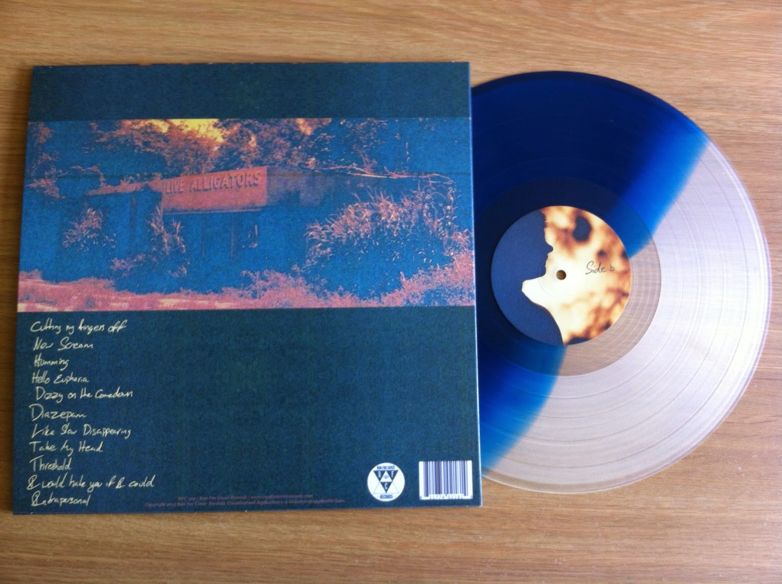
Turnover - Peripheral Vision - Run For Cover - 1st Press - Milky Clear // Sea Blue /1500 

Visually, this record is stunning. Due to the grainy imagery throughout the sleeve design, it's pretty hard to do the art and layout any justice but trust me, it's some of my favourite album art this year. The variant is great too, and the halves of the record haze into one another which works with the whole sound of the record too. Completely irrelevant probably, but a nice touch all the same. 


Back Cover // B-Side 

The 'Live Alligators' sign on the back cover is interesting and I wish I knew a little more about it. All of the photography looks like it lands in the '60's or 70's. The photography is also not credited in the liner notes, only the layout. 


Insert 

More 'of the era' photography and lyrics for the first 5 tracks of the record. The imagery and handwritten text across the album fit in great with this record. Most people listening to this will give you the whole 'it's so dreamy' spiel when trying to give a sonic description. To me, it sounds humid and it's the only way I can get my point across. It's like one of those days where it's too hot to do anything, so you just lay on your bed with the curtains closed and the windows open. This record sounds pretty close to that feeling, in the best way possible and for me at least, the art is representative of that. 


Lyrics and Credits. 

The credits here are pretty short, with no thanks. At this point it looks like space is running a little thin anyway, and lyrics are a far better use of space for a lyric sheet right? 


Stickered Sleeve 

I love a good sticker on a sleeve, and this shiny little dude looks perfect. More importantly it guarantees a polysleeve with my record! 


If I keep up my current love for this record, it's definitely got a space in my AOTY list. The growth from release to release with this band is beautiful to see. 

Cheers!


Thursday, 14 May 2015

Crystal Clear?

I didn't pick up many of the Run For Cover RSD releases this year. In fact I think I only picked up one. Weird, I would have grabbed Pity Sex and Weekend Nachos if they were in my local store. I just haven't hunted round for them too much. 
However, the one release from this label I did have a little lurk around for was the newest Camera Shy 7'', slotted in between a great debut EP and the promise of a new album coming out real soon. The first thing I fell for here was the art, and ordered without so much as a cautionary listen on Bandcamp. 


Camera Shy - Crystal Clear (Record Store Day) - Run For Cover - 1st Press - Blue // White Colour in Colour /1000 (RSD '15) 

The same as their Jack 'O' Lantern EP, I fell in love with the theme of the art, as you can see here. 
http://23rotations.blogspot.co.uk/2014/08/i-remember-halloween.html
Weird enough that I titled that post as I did, considering there is a Misfits cover on this new 7''. 

The weird centre label of a Guinea Pig is something I can get behind too. I thought Crystal Clear would be a precursor for the variant too, so it was nice to see this instead. 


The layout of this record is similar to the 10'', which is a weird but kind of nice little consistency over the two releases. 
It states that all words and lyrics are collectively written by Camera Shy, neither Danzig or the Misfits are credited here which seems a little odd. RFC are no stranger to holding out a decent cover or two on their releases, and I'm sure they're normally credited? 
Here you see a little more of the variant, and the contrast of the blank centre label on this side goes with the format of the back cover. I'm not sure whether that much thought went in to it, but we'll run with it right? 


Insert. 

This is a single sheet insert with no lyrics on the reverse side. However, I like that it was included purely for the sake of a little more art. Running on this sweet Halloween theme is always a bonus too. I'm not sure how long it will go on for, but this continuity in their releases is pretty great so far! Now I need to hunt down a copy of that Mixed Singles 7''... 

Cheers!


Wednesday, 13 May 2015

Acoustic #2

Having recently grabbed another Tigers Jaw record I was missing, and realising I only have a couple of things to grab til I have one of each release (some of their back catalogue is a right pain in the arse to find) I thought I'd drag this 7'' out for a quick word or two. 


Tigers Jaw - Run For Cover Acoustic Series #2 - Run For Cover -1st Press - Black - 400 

Sadly, one of the records I am missing is the acoustic series #1, and the CMJ Flexi (oh, there's the alternate cover of the Hum 7'' that would be great to own too!). However, no time to moan as this record was a great score. Me and a few buds run a Facebook group for buying / selling / trading records and someone was selling through there, so I jumped in early for once and grabbed this. 


Back Cover // B-Side 

I really like the idea of this record, and I wish that RFC had kept these Acoustic Series Records installments up for a little longer - some of their roster would suit this perfectly. I think Tigers Jaw made the first two, and Daylight (Superheaven) went in for the third installment and after that it went a little quiet. 

All on Black, all with Silver labels, one time pressing. It just seems like a great little release for a label, and one of the many reasons why I dig what RFC do so much. 

Minimal on the sleeve front, just a folded piece of paper. Folded covers are cool though so it's all good. Delightfully lo-fi recordings and definitely the Tigers Jaw record I am happiest to own! 


Saturday, 11 April 2015

Feeling Supersonic

This is one of my favourite records of the year so far. I bought / photographed this ages ago but never got around to posting about it as I thought I'd have little to say on the matter. But even if I fall short a little on the words, maybe the enthusiasm will come across all the same. 


Adventures - Supersonic Home - Run For Cover Records - 1st Press - White W/ Light Blue Marble /1000

White W/ Blue Marble may be a bit of a stretch, as this thing is like 98% white. Maybe some copies of this variant came with a little more blue in it. I ordered this from All Your Music, and was kind of hoping for the Starburst variant but for there's always a little fun in blind buying records right? 


Back Cover // B-Side 

The font on this is a little hard to read from a distance I guess, but it looks great with the artwork and RFC mixing up the logo colours pulls everything together nicely. It's a shame I didn't take a photo of the spine as it sticks out like a sore thumb (you can kind of see a bright yellow sheen down the side of the LP, that's about right; at least I have no trouble finding it!). 


Inside Gatefold 

This record comes in a nice thick gatefold sleeve, and on the inside is more artwork by Kimi Hanauer. Kimi plays keyboard and sings in Adventures, and was also semi responsible for the art and layout for the Pity Sex // Adventures split. I'm really not too sure on  the theme for this album art, but the little dude in a boat is quite a cool thing. There's a nice Adventures longsleeve on the RFC webstore that I'm tempted to grab, and this guy is on the back. Before I heard the record, I really wasn't feeling the art at all; but after some time to see how both fit together, I've warmed to it a lot. 


Insert 

Handwritten lyrics in inserts will always grab my attention more so than printed ones, although they can be a little harder on the eyes at times. It seems a little strange having a nice gatefold sleeve and an insert too, but using all the available space for art  must be a cool thing for anyone working with design and layout. For every RFC release I buy, I am never let down by what is going on; even if it's nothing particularly out there. They just seem to be getting it right if you know what I mean? 


Insert 

This side of the insert houses the rest of the lyrics, band personnel, thanks and credits. Alongside all of this you also get a band photo and some more art from Hanauer.
Over 3000 of this LP were made over 3 variants for the 1st Press, which seems like a huge number but I really hope more and more people catch on to how incredible this band is. Although we're only a third of the way into the year (or thereabouts) I'm fairly confident this isn't going to leave my iPod or turntable any time soon. 

Next post is probably going to be a touche amore one, just as a heads up. Been waiting on something cool...
Cheers!


Sunday, 8 February 2015

Ruin Yr Mynd

This is a record that I've been eager to hear for the longest time. It's sometimes a little difficult to really get an idea of a record you've hyped up in your head for so long, so after a week or four of letting it sink in, here it is... 


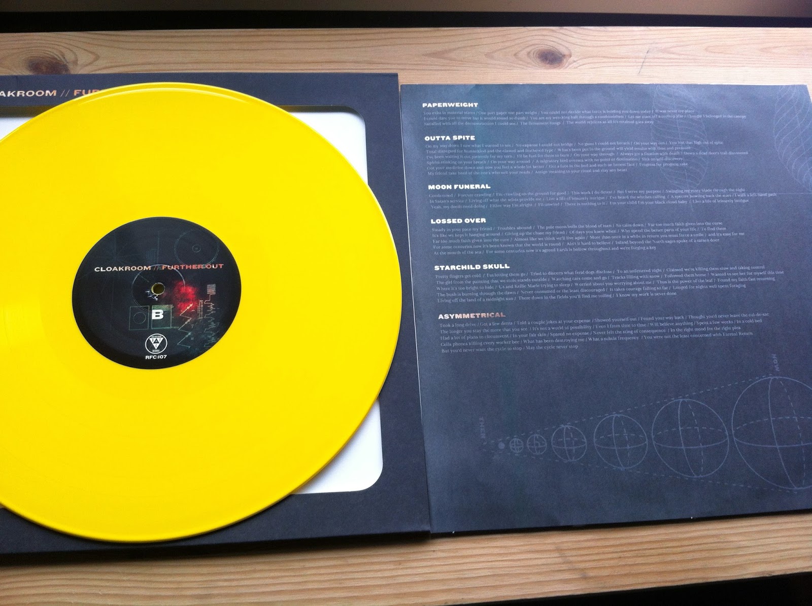
Cloakroom - Further Out - 1st Press - Run For Cover Records - Yellow /700 (2XLP) 

It's probably a little easier to get photo heavy on this post rather than try to explain all the stuff going on here; for once it'll be a little less War And Peace right?


Cover 

This record is pretty heavy going (in the best way!) on the design front; so lets just start here. Rather than a gate-fold sleeve, both records are slipped inside a single jacket with a large porthole cut in the cover to accommodate the art from the printed inner sleeve. 


This is kind of how that works? A fairly small deal to most people at a guess, but it really needs to be held and fumbled about to be honest. At first I was a little worried how it would hold up, but the sleeve is super durable. Think about The Devil And God style design, in terms of the sleeves and jacket texture and quality (not the MOV re-press, you don't need that).


 Back Cover 

Tracklisting // Constellations // Space. 
These kids love space. 


On to the wax. 

Casey Donley handled the layout and design; but Alison Scarpulla's photography is what really sells this for me, so I'll go through the record side by side. I know the photo is the wrong way up, but all inserts should be stored opening up right? 


B- Side 

Lyrics on this side of the insert. Fairly standard stuff. Illustrations of planets, and you know. Space. Matt Talbot recorded this LP on reel to reel at Earth Analog, and there's definitely a huge Hum influence in this record. Being a big fan on Hum this came as great news, and it's definitely helped Cloakroom to get to a more focused sound. Talbot even added voice and guitar here and there. I've heard a lot of positive words over Further Out. People have already been throwing the tag 'Album of the Year' around. 


C-Side 

The design on this side of the dust cover is cool. It must be difficult to fit in a theme for so many different aspects of the design on this LP. Good job dudes. 


D-Side 

It's hard to think that this album has been recorded a year already and it's still such a fresh release. A year seems like a damn long time to be sitting on such a great bunch of songs. However, worth the wait is a total understatement and this record has been getting way too much attention from me and I'm slightly worried about overplaying this one. Speaking of playing this record, and specifically this side; there is a locked groove. I only have a few records in my collection with locked grooves, but it's always fun seeing kids get weird on the internet about it! There was a hint about it on the RFC store.
Run For Cover have been on a roll with great releases over the last few years. There are a few of the bigger US labels that have dwindled in interest for me, but RFC hold it down; often favouring cool production and presentation. I'd love to know more about these illustrations too!
This is solid yellow though, not even a little gold. 

Cheers!


Thursday, 15 January 2015

∞

With a new Cloakroom album due to drop next week (there's already so much coming up in 2015 I'm looking forward to) I thought I'd best add the Infinity EP to my collection. It's one of those that I've listened to time after time and enjoyed a bunch but never actually got round to picking up. Well today it finally turned up so I can get to writing about it! 


Cloakroom - Infinity - Run For Cover Records - 2nd Press - White /550 

The first thing that jumps out about the packaging is the hole in the sleeve right? I think these are referred to as a 'Disco Sleeve' but that's a super dumb name so lets skip over that. 
Although the variant is stated to be White, there is a ton of bleed and looks to be more of a Grey Marble than anything, but this seems to suit the somewhat muddy feel of the record. It's funny how things work out at times I guess! 


Back Cover // B-Side 

Artwork on this release was handled by Reuben Sawyer at Rainbath Visual and it's a style you can tell from a mile off. There's something a little unsettling in all of the work coming out of there. The jackets are quite a thick card and have the appearance of being screened, but I can't find much out on that front. 


Insert
As opposed to a full size insert, this looks more like a bookmark, and it fits quite well in the sleeve without being seen through the centre holes. This side contains all the lyrics. Band personnel, recording credits and thanks (it literally only says thanks) are on the back cover. 


Insert 

The other side of this insert contains the illustrations that grace the centre labels of each side of the record. There's something super bleak about this, which kind of meets the feel of the music I guess? Speaking of the centre labels, I really should have taken photos of the record in the sleeve to see how centre labels fit in the artwork. Balls. 

Listening to this record through my setup has got me really excited for the new LP. Run For Cover had started streaming it early, but I'm holding off 'til I get it in my hands. From the snippets I've seen of the packaging, it looks like a cool one too! 

Cheers!