A couple weeks back I posted about the One With Serenity Test Press from favourite UK dudes Fade (you can read all about that one here: http://23rotations.blogspot.co.uk/2015/01/test-with-serenity.html).
Fast forward to today and all the standard variants arrived safe and sound so I'm going to talk about those. Again, it'll be a bit more showing you the record, a little less talking about it. This is because I know I'll end up turning the conversation towards the musical content over the actual product. Just so you know though, it's great. The amount of times I've already talked about this band through this blog though you should really have got it by now. On to what matters!
Fade - One With Serenity - Neutral Words Records - 1st Press - Clear /75
The first thing I noticed with this record when it arrived was how thick the sleeve is. I saw through the NWR Instagram that Max Harper (he runs NWR, so I'm assuming?) printed up all the sleeves, cutting and folding them too. Pretty mad effort considering that's 300 sleeves to make and assemble. Another thing to note is the card dust covers as opposed to paper ones. Paper ones don't bug me as such, but these certainly feel a little sturdier.
As Clear was the rarest variant and quite low in numbers, it's long sold out but you can still grab the other two online.
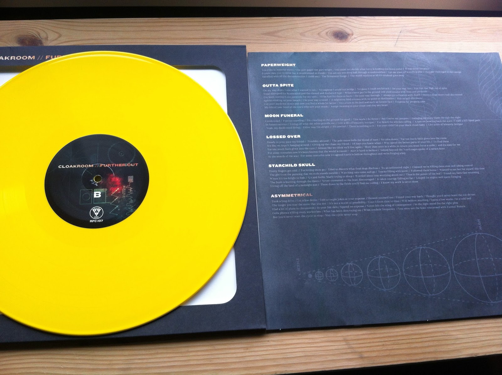
Back Cover // B-Side
Track-listing sits in a circle in the centre of the back cover which looks kind of cool. It's a real shame that one track is a digital bonus, Persona is a great song! It's funny that both records have been pressed on 7'' and both releases have tracks omitted due to time constraints (this band write mad long songs). I'm secretly hoping for a tape press or something to accommodate the full release in one place; plus I can't say no to buying stuff from this band.
B-Side label has a cool group shot, but we'll see a little more of that later on.
Fade - One With Serenity - Neutral Words Records - 1st Press - Black /100
Next up we have Black. I was assuming this to be the most common variant, but it sits in the middle between the two colour presses. There's still something super charming to black vinyl; maybe the way it can work alongside any artwork? Maybe the audiophile nerd in me that tells me that black wax should always sound better than colour. Not that my ears can really tell a difference, but it helps me to play close attention.
Back Cover // B-Side
I forgot to photograph it, but it's really cool that these sleeves open up along the spine and the artwork can carry through. it looks neat all laid out like that too. Balls. The text on the bottom right is recording and mastering credits (also noted on the insert, it's a little easier to see there too). Bottom right is the Neutral Words logo.
Fade - One With Serenity - Neutral Words Records - 1st Press - Green /125
There's a little blue mix in the green, it's not particularly easy to see on a photo but it's definitely in there. I like the use of two logos on this 7'' too. The cover uses the new logo (which looks a little like half a Black Flag logo, never a bad thing) and the older logo on the A-Side centre label.
B-Side // Back Cover
No 'A' on the A-Side, but there's enough going on with the label logo, designation, band logo and track-listing on this side to kind of state the obvious right? The B-Side 'B' looks a little like the Triple B record logo cut into 1/3. Fade's sister band Shrapnel are on the Triple B roster, so maybe there's some vague connection as to why? Maybe it's pure coincidence?
Insert
Full sized photograph from the B-Side label. All copies came with this photocopied insert, and I assume these were all done in house too.
Insert
Let's have a quick run down of what's going on here. I said I'd leave this one to a little less talk, a little more see for yourself kind of deal. I lied, sorry.
Band personnel
Live photo from the Brudenell in Leeds at a guess.
Under the photo is a couple lines of thanks.
Left side: One With Serenity lyrics
Right side: Reverie Swimmer lyrics
Centre: Fade Logo
Bottom Centre: Recording credits, band personnel (also explaining the lineup change with regards to the new bass player). Photography and layout credits. Finally, email contact.
It's easier to step by step this one as there is a fair deal of text to cover. I really like folded up photocopied inserts in 7''s. It always reminds me of old Rev or Malfunction 7''s. I know the newest Title Fight 7'' through Rev had photocopied inserts on different coloured paper and people got all crybaby about it. Plain black and white saves confusion on this one I guess, as I would've been a total crybaby if I was missing something as dumb as a colour insert.
With the pre-order there was also this screened 'Roster' poster. This label have a tight logo, and are putting out some great stuff from a whole range of cool bands. Forsaken are definitely a highlight in the whole hardcore/ thrash crossover thing for me. I'm not good with genres...
Finally, money shot!
I've fallen really lucky with grabbing variants and tests from this band. As it stands I am 100% completely up to date as far as I know; and that is solely down to guys who run record labels being super nice and understanding when it comes to how enthusiastic I am with this band.
Space Rock. It's a thing. Listen to Hum. Nebula and Cosmos and stuff. If I was on my phone I'd gab that little rocket and alien emoji.
Cheers!