This is a record that I've been eager to hear for the longest time. It's sometimes a little difficult to really get an idea of a record you've hyped up in your head for so long, so after a week or four of letting it sink in, here it is...

Cloakroom - Further Out - 1st Press - Run For Cover Records - Yellow /700 (2XLP)
It's probably a little easier to get photo heavy on this post rather than try to explain all the stuff going on here; for once it'll be a little less War And Peace right?

Cover
This record is pretty heavy going (in the best way!) on the design front; so lets just start here. Rather than a gate-fold sleeve, both records are slipped inside a single jacket with a large porthole cut in the cover to accommodate the art from the printed inner sleeve.

This is kind of how that works? A fairly small deal to most people at a guess, but it really needs to be held and fumbled about to be honest. At first I was a little worried how it would hold up, but the sleeve is super durable. Think about The Devil And God style design, in terms of the sleeves and jacket texture and quality (not the MOV re-press, you don't need that).

Back Cover
Tracklisting // Constellations // Space.
These kids love space.

On to the wax.
Casey Donley handled the layout and design; but Alison Scarpulla's photography is what really sells this for me, so I'll go through the record side by side. I know the photo is the wrong way up, but all inserts should be stored opening up right?
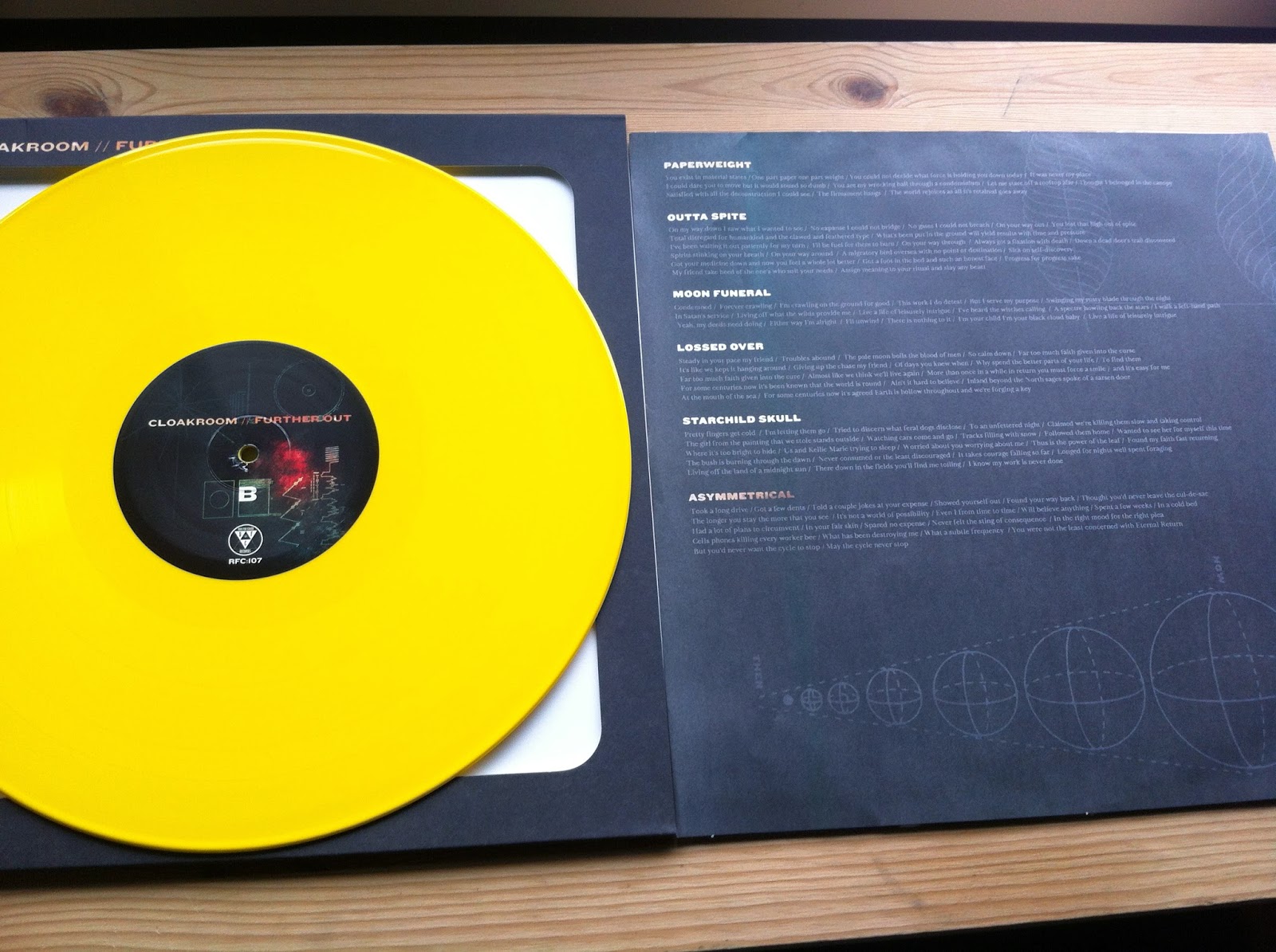
B- Side
Lyrics on this side of the insert. Fairly standard stuff. Illustrations of planets, and you know. Space. Matt Talbot recorded this LP on reel to reel at Earth Analog, and there's definitely a huge Hum influence in this record. Being a big fan on Hum this came as great news, and it's definitely helped Cloakroom to get to a more focused sound. Talbot even added voice and guitar here and there. I've heard a lot of positive words over Further Out. People have already been throwing the tag 'Album of the Year' around.

C-Side
The design on this side of the dust cover is cool. It must be difficult to fit in a theme for so many different aspects of the design on this LP. Good job dudes.

D-Side
It's hard to think that this album has been recorded a year already and it's still such a fresh release. A year seems like a damn long time to be sitting on such a great bunch of songs. However, worth the wait is a total understatement and this record has been getting way too much attention from me and I'm slightly worried about overplaying this one. Speaking of playing this record, and specifically this side; there is a locked groove. I only have a few records in my collection with locked grooves, but it's always fun seeing kids get weird on the internet about it! There was a hint about it on the RFC store.
Run For Cover have been on a roll with great releases over the last few years. There are a few of the bigger US labels that have dwindled in interest for me, but RFC hold it down; often favouring cool production and presentation. I'd love to know more about these illustrations too!
This is solid yellow though, not even a little gold.
Cheers!
No comments:
Post a Comment