Now, I would like to think of myself as being fairly sensible most of the time. However, there is always one exception and that is when it comes to Morrissey. The amount of times I have rationalised a purchase, an overnight drive, a tattoo etc. with the phrase 'because Moz' is almost scary, and this post is no exception.
As a little back story, a week or so back HMV hosted their #lovevinyl event. The long and short of this is that they took about 15 albums or so and reissued them, either on exclusive colour vinyl or with an exclusive sleeve. I find it a little strange that HMV cottoned on to the whole exclusive vinyl thing so late, but I really have no gripe with them doing this. People on the internet got mad; I didn't care.
What I did care about was the 3 Mozza reissues that were coming out on the day. If anyone asks me my favourite artist // favourite band - I will always either say Morrissey or The Smiths. I don't really have a favourite, but I'm not about to come out with that sentence as it cuts conversation short and makes you come across as a bellend most of the time. Moz has been a constant in my life since I was 8 years old, and considering this fact I have very little in the way of Moz records. My Uncle donated me his entire discography (at the time) on CD around 2000 so I never went back and played catch up aside from a few choice singles. This year, I am going to make an effort to change that and this was a good way to cross a few off the list. Now, with very little typing for the rest of this post, on to the important stuff right?

Morrissey - Viva Hate - Liberty // Parlophone // His Master's Voice - ? Press - Gold /500 (HMV #lovevinyl 2015 Exclusive)
This press uses the 2012 reissue cover, and comes in a Liberty printed dust cover with Liberty labels, although the Parlophone label stays on the cover. I was expecting these 'Gold' reissues to be on Clear Orange as they normally are, but I was pleasantly chuffed to see them on this solid colourway instead.

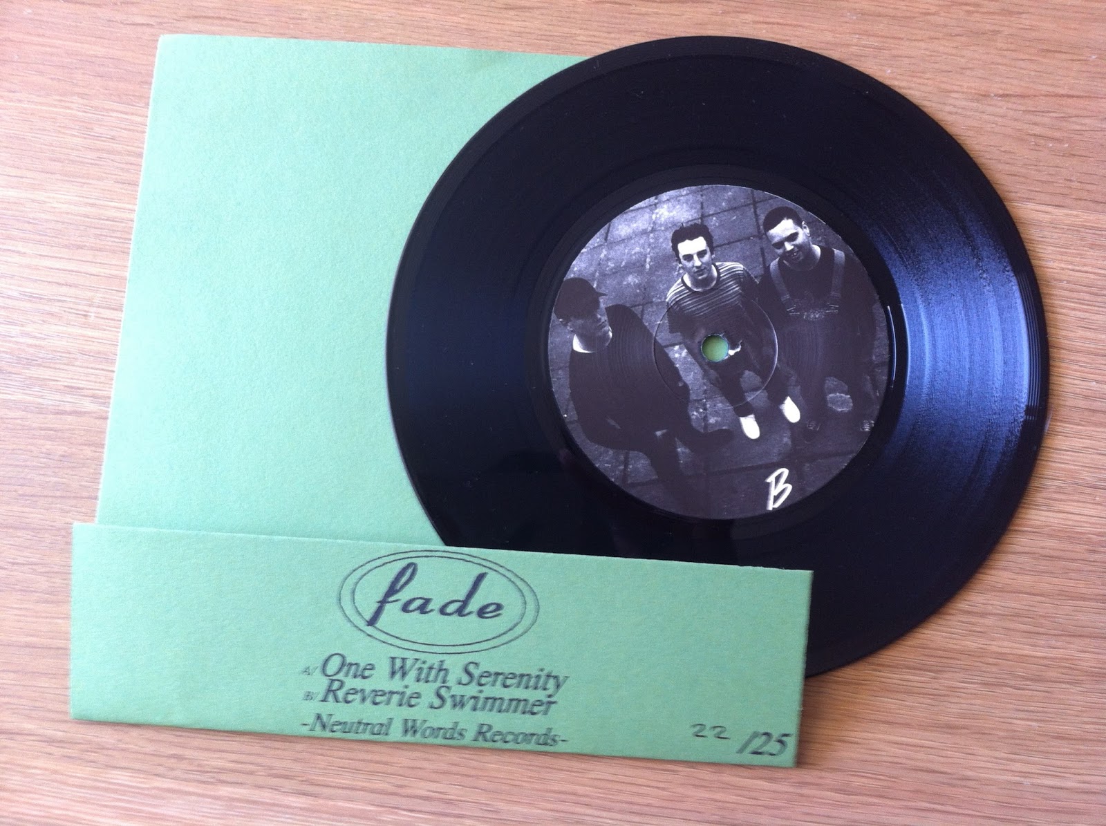
Back Cover // B-Side
This particular variant always seems to leave a nice swirl or mix across the record that I can definitely get on board with. I find something charming about finally seeing these records on colour, and as long as I get a copy of each record I'll happily take what I can get (although the need to hunt down an 'Education In Reverse' copy of this record is getting quite overwhelming).

All of these records came in nice gatefold sleeves, and feel super sturdy. Some of the photographs from this reissue were taken by Anton Corbijn, and given some of the iconic images that guy is responsible for it just makes me even happier to own this. Left panel shows the track-listing, right panel contains various credits.

Morrissey - Your Arsenal - Parlophone - ? Press - Gold /500 (HMV #lovevinyl 2015 exclusive)
The colour scheme on this record works incredibly well. Black and Gold art with a gold record sat in a plain back dust sleeve. I remember getting all the Moz albums on CD, and this being the most immediate of the bunch. The cover photo was from a live show in New York I believe.

Back Cover // B-Side
Classic Parlophone centre labels, and overall a great layout. I know I'm massively biased, but there is something so iconic that rests in everything Moz touches. I'm sorry if you're not a fan, this post is probably really sucking for you right about now.

Gatefold.
Band shot. I mean, there's not much more to say on the matter really? For years and years, there has always been a change in lineup, and no two records have the exact same players I believe (although I haven't thoroughly checked). This photograph was taken by Kevin Cummins, and the album was produced by Mick Ronson, around a year before he passed.

Morrissey - Vauxhall and I - Parlophone - ? Press - Gold /500 (HMV #Lovevinyl 2015 exclusive)
I often go in cycles of listening to a Morrissey album constantly for weeks at a time, and it happens with this one more than most. Again, there is no favourite record but for the sake of conversation I normally go with this one. When an album closes with a song like Speedway, there's nothing else to call it but a classic. True To You.

Back Cover // B-Side
There seems to be a little Black seeping into the swirl of this record, more so than the other two. Shout out to those super jazzy centre labels too. The English Martyr's Club sign is used on the dust cover too, but I forgot to photograph it. On that note, this is the only record of the three that has photography lining the inner sleeve. For saying that these records came out together for the same event, I love the little intricacies that place them apart from one another. It would've been easy to stick them all in standard sleeves with plain dust covers; and to be honest that's about what I expected from HMV. Thankfully I was proved wrong and these look great and play perfectly.

Insert and Gatefold

Gang Shot
Every record came with the 'Limited Edition Gold Vinyl' and another 'Strictly One Per Customer' sticker on the cellophane. Some also had a 'HMV Exclusive' sticker too, but these copies did not. To bring this whole thing full circle, yes I paid £60 for these without a seconds hesitation, and honestly speaking I would've forked over just about whatever people were asking for them if I hadn't been able to grab them on the day (and honestly these things are being flipped on the bay for crazy money right now). Why you ask?
Because Moz.
Thanks for reading!