Showing posts with label Deathwish Inc. Show all posts

Monday, 9 November 2015

Pink Libertine

It's quite rare nowadays that I go searching for a record purely for wanting it. I really have little need for this 7'', as it only contains 2 tracks from a record I already own. In fact, I've paid for the privilege of hearing them in their original form before the remaster (from what I can tell). On paper, this was a little bit of an unnecessary purchase, but being honest I'm pretty happy to have it. 


Deafheaven - Deafheaven - Deathwish Inc. - 1st Press - Black /1000 

So this was a promotional 7'' made by Deathwish and given away in random orders. I'm assuming it was to coincide with the release of Roads To Judah, but at the time I picked up Roads... at distro and can't know for sure. 
This record contains 2 of the 4 demo tracks, that Sargent House later compiled onto a remastered 12''. Funnily enough also on black and /1000 copies. 


Back Cover // B-Side 

Plain black centre labels, plain black vinyl. I'm a big fan of how this looks. The cover art is nice, and something different from the original demo art, and the 12'' art. That was probably a larger factor than it really needed to be. I grabbed this off eBay with surprisingly little fight considering the hype around the newest LP. 


Close up of the text on the black cover. 

The inside of the sleeve is plain white. Although I had to pay for a record that was once given away for free, I really like the fact that Deathwish did this in the first place. There was no way to squidge the entire demo on a 7'', as it cuts in at about 24 minutes over 4 tracks, but these two songs are great together. 
I think I now own one of every Deafheaven release that has been put to vinyl. I'd never jam into variants with this band, but it kind of helps to make everything feel a little more complete. 

Cheers!


Friday, 24 July 2015

For God and Country

Here we fall into the section of posts I like to call 'look at all the cool stuff I got at Alan's'. For those that keep up with this blog, you'll probably know that Alan Beningfield runs Different Kitchen records and that every couple of month-ish I take a trip to his house and collect a stack of the best stuff. On this trip I bought back with me a mix of stock from his store, orders from labels that we had split and even a Discogs bag or two. I probably won't write about every record I bought else this set of posts would never end, but a few won't hurt right? 

So let's start with a band that I write about here every now and then, and this variant in particular looked so great I couldn't resist a second copy. 


Cursed - One (Reissue) - Deathwish Inc. - 1st Press - Clear W/ Blood Red, Royal Blue and White Splatter /300 

This variant sold out straight away when it came up for sale on Record Store Day 2013 I believe? Since then it occasionally pops up on the Bay, but I never went completely out my way to get one as I got the distro colour from this press (Silver /2000). However, a few weeks back I got the splatter version of 'Two' and since then I got a hankering to own this. Fortunately it tied in that Deathwish had some kind of warehouse clearance and found a few copies of this kicking around and put them up in the store at the same price they always were, and as Alan was putting an order in for the new Coliseum record (or possibly the Planes Mistaken For Stars reissue?) I asked if he would add this the order. Above and beyond man, thank you! 


Back Cover // B-Side 

The back cover used the original press front cover art I believe, and the front cover is from the Thrash Art press. People got a bit weird about this being called a 1st press as Deathwish had already put it out around a decade before, and then Thrash Art reissued it after. However, I assume that with the new art and the reissue tag, it got a remaster and the art is definitely expanded so it makes it a new record in it's own right I guess? I think they made completely new plates for this press too; as I never had a 1st press for comparison I'm just happy in the knowledge that this press sounds incredible.


Inside the gatefold. 

Chris Colohan draped in an American flag. O' Canada! 


As is the same with 'Two', the reissue came with a big double sided poster. However, this one comes on a glossy almost photo paper type material as opposed to card type stock in 'Two'. Both look great and you probably can't tell from a photo, but nevertheless have a photo of He Goat. 


The other side of the poster came with this photo of Colohan. The intensity of a Cursed show is something I'll most likely never experience but you can hear it in the record and you can see it in this photo. Forever envious. 


The small section of writing from the Colohan side of the poster contains all the lyrics and credits. It seems weird that there is so much space on this reissue and yet they were stuck in the smallest corner of a huge poster. It seems a little odd to me, but for how incredible this reissue is, I'm really not going to call this a fault. 

To put it simply, this band are fucking untouchable and I can't wait to hear what Deathwish does with Architects of Troubled Sleep. 

Cheers! 


Sunday, 19 July 2015

Deathwish Mail Day (kinda)

I like doing mail day posts. I kind of feel they give an idea of where my buying habits are at in a certain point in time. This year, Deathwish Inc. have been killing it consistently, and this post is nothing more than showing a couple additions to the family. At this point I have ran out of storage room and all of these are on the floor by my bed which I'm not too chuffed about. But, buying records over buying record storage any day. 


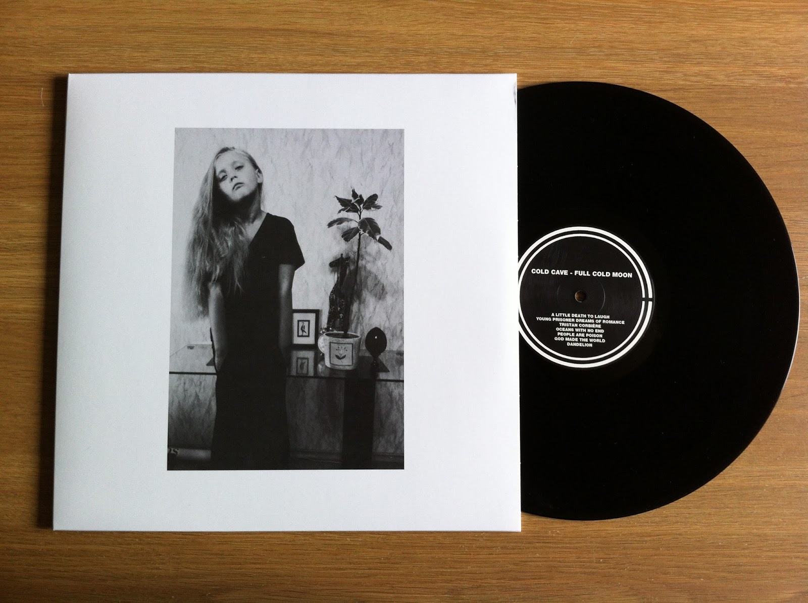
Cold Cave - Full Cold Moon - Deathwish Inc. - 1st Press - Black / 1742 

This record originally came out on CD through Eisold's Heart Worm imprint, with different cover art. I nearly jumped on that but held out in the hopes of a vinyl version. Thankfully, Deathwish delivered and I am a huge fan of how this turned out, 


Back Cover // B-Side 

Do I own most of these songs on vinyl already? Of course. Was I going to pass on owning the Nausea, The Earth And Me EP on vinyl when it was digital only until now? Of course I wasn't. The centre labels are cool too, the CC logo that frames the track-listing each side is a nice touch. 


Insert 

Originally used for the 'God Made The World' 7'' Picture Disc, this side of the insert is printed on photo paper I think, extremely high gloss. It looks great, but watch out for all the finger smudges that will no doubt get all over this! 


Insert 

Whilst lyrics are cool, I thought I'd concentrate on the small list of thanks and this poem Wes leaves us with. I'm not sure if this has been used previously as I'm not as familiar with his written works as I would like to be. This is definitely spurring me on to grab some stuff as I come across it. 


Finally , this sticker was on the shrink which I clumsily peeled off and stuck on the dust cover. This sticker displays the 5 EP's that make up the compilation. Cool right? 


Self Defense Family - Heaven Is Earth - Deathwish Inc. - 1st Press - Clear /2100

Another quick minute, another SDF release. At any given time I am missing at least 3 or 4 records from this band. I know that I'm missing the Talia 7'' from recent months and weirdly enough the Scotland 7'' too. Not because I lost interest, purely because this band release so much I cannot keep up. However, I saw this and couldn't say no. I'll definitely grab what I'm missing, but this intrigued me to the point of needing to grab right now! 


Back Cover // B-Side 

Although any colour of this would've looked great, the most common colour will do just fine. My favourite part of the layout is how the back cover acts as an insert for this one. As a result, you get a dust sleeve and a download card. Compared to the relatively lush layout of 'Try Me', this one seems a little stripped back, but that's not a problem at all. Some of my favourite SDF songs are here, and with every listen I get sucked in more. 


Again I'm skipping over the lyrics on the back cover for the more interesting part. This record was recorded over 4 different studios, with 4 different producers coming from a range of genres. This small section explains what songs were recorded where. Weirdly, this record seems remarkably consistent and although you can hear a difference in the tracks it doesn't sound remotely disjointed. 


Again this record came with a sticker on the shrink, but after the bodge job I made on getting the Cold Cave one off, I thought I'd leave this one be. 

This post proves another point for me. With how vinyl is coming such a popular thing nowadays and how my love for music is ever expanding, I'm overwhelmed with how much there is to buy. As a result, I don't pre-order every record in hopes of scoring the rarest variant and in this case, I settled for whatever Amazon had and it cost me about 2/5's of what it would've cost in shipping from the label direct. Not Deathwish's fault at all and that's cool, and you can bet that I'll still chase variants a bunch. However, sometimes I would rather settle on a more common variant and buy more records? 

Thanks for reading!


Monday, 22 June 2015

Pink Claws

I feel like I hit the eBay route less and less recently for buying records. With the pending change from Paypal as a payment option and with the rise in kids scraping up any *vinyls* they can get their hands on, it just seems hard to grab anything for a decent price these days. However, there will be an occasional come up and a couple of weeks ago I managed to grab a record that had interested me for some time, but I never took the dive on. 


Rise and Fall - Clawing - Deathwish Inc. - 1st Press - Pink /850 

Weirdly enough there was no interest in this 7'' and I won it at the opening bid of 99p with no fuss at all. This record was released the best part of a decade ago and I love collecting older releases from Deathwish. Such a solid label with an incredibly rich history, and I'll happily take a chance on whatever I don't have. 


Back Cover // B-Side 

The R//F centre label designs are pretty cool, and I love how bright and detailed the artwork is. It works perfectly for a 7'', although I would've loved the full art to have come in somewhere though. 


Fold Out Cover 

I believe there was a limited version of this 7'' that had the outer cover in this colour scheme. Personally I love the full colour art, but I really dig anything that Florian Bertmer does. His artwork is completely unmistakable, and the long damn list of incredible bands he has worked with still baffles me. 


Close up of the insert

Sorry this hasn't photographed up too well, the font is a little hard on the lens, but you get the general idea. Plus, the cover of 'Them Bones' is brilliant and more people should hear this record. A total gem from a label that gets it right more often than most. 


Fold Out Cover Art 

Although the original art is much larger than this, I love how this sleeve works with what it has. If the art was scaled down to fit it fully I guess it would look kind of dumb and lose all it's appeal. Maybe Shirts & Destroy should have done a similar deal with this record like they did True Nihilist? 

Either way, this record is cool, the art is cool, the label is cool and I'm going to scoop up some more Rise and Fall records in the near future with any luck! 

Cheers!


Saturday, 23 May 2015

Someone's Going To Get Burned

Wow it's been a little while since I have done a post on Cursed. There's a little bit of a back story here, so bare with me as it's probably not too interesting. 

Cursed II goes up for pre-order on Deathwish after months of two-ing (funny pun) and fro-ing. II has been bootlegged (much to the approval and amusement of Colohan) and getting a legal copy of this out was a huge hassle due to the financial backers from Goodfellow records way back in the day. The original press of this was not sufficient for demand right from the start and has only become more sought after. Anyway, I told myself that I didn't need this record, even though I was right there at the time of pre-order. The reason I didn't need it is because I have the original press on clear that you can read all about here: 
http://23rotations.blogspot.co.uk/2014/09/more-cursed.html 

Not too long after I got complete regret over the whole ordeal, and that most limited variant got me all gooey inside as it looks incredible. So I did the whole eBay lurk, decided that paying through the teeth was stupid and hit up the 'notify when back in stock' button on the Deathwish store and held out a little hope. 


Cursed - II - Deathwish Inc. - 1st Press - Clear w/ Multi Splatter /315

After a bit of luck, and a good few weeks of being held in customs (no charge though so that's lit) this finally turned up. It's got a corner ding or two, but Deathwish are solid dudes and how this travelled isn't in their hands; it was packed well so must've had a pretty rough ride. 


Back Cover // B-Side 

Deathwish are incredible with the re-issue treatment (I can't wait to see what happens to Mercy by PMFS), and there isn't a lot of similarity in the two GFR and DW pressings. New front and back art, new variants and updated centre labels; all without even looking inside the gatefold (another difference!). 


Printed inner sleeve, made of sturdy thick card which looks great. This side contains all the lyrics and it's really easy on the eyes. Reading through all these lyrics, you see how explosive Cursed were, and probably pissed a lot of people off in the process! 


Live shot on the other side of the inner sleeve. Black and White imagery fills this record, and it really sums up the songs here. Not a lot gets lost in metaphor here, it's pretty in your face. 


Inside the gatefold

A few words from CC on the recording of the LP, the lyrical content of some of the songs here. Also, it adds more mystery to the story of Cursed. There is a popular opinion that a band has to be shrouded in mystery to be truly legendary, and this band really have that feel for me. They just imploded overnight, and even now very few words are spoken on the matter. 


This is the top image from the gatefold, I can only assume that it's from an old horror film. Deathwish also put this up on a shirt at Pre-order stage, along with some other great designs.


Finally, this record came with a huge fold out poster of Vincent Price. It would look great in a frame, but you know; parting a poster from the sleeve is something I just don't have in me. 

Deathwish did a great job here, and I'm glad I got a second chance here. Not only because it looks great, but because it sounds monstrous. I can't leave this record alone, and let's hope Cursed III doesn't have the time gap like this one did. 


Sunday, 12 April 2015

Does It Matter?

So a band that is often featured on this blog is Touche Amore. That would be for two reasons: they are one of my favourite bands and secondly, I definitely have more Touche records in my collection than any other band. At the moment, I am about as complete on this band as I'm ever likely to get without throwing stupid money on test presses. But less dwelling on that, and a little more on the subject at hand; the Touche Amore // Self Defense Family Collaborative 7'' entitled Self Love. Long story short, both bands got in a room, all plugged in and wrote two songs. Will Yip recorded it, and the whole thing was done in a weekend if I remember right? As both bands contributed to both songs, it breaks the standard format of a split 7'', hence the collaborative tag we're throwing around today. 


Touche Amore // Self Defense Family - Self Love - Deathwish Inc. - First Press - Opaque Light Pink /300 

Both centre labels have text in a circle, and from what I can tell neither are related to the lyrical content of the respective song. This side has the track Circa 95 (you can see up top of the label, Deathwish logo at the bottom); and out of the two this seems to have a bit more of a TA vibe. The variant itself is pretty neat but doesn't photograph too well, as there are a few different shades of pink and a little white in here. This was the standard '1 Per Customer' pre-order colour from Deathwish and it sold super quick. 


Touche Amore // Self Defense Family - Self Love - Deathwish Inc. - First Press - Transparent range /726

As there are a few variants to get through, it makes sense to photograph the A side of some, the B side of the rest right? Saves looking over the same thing too much I guess? Centre labels are a different colour to one another, but more importantly all the information about the recording and the lyrical content is on the back here. No insert included. There are 15 people credited here (14 musicians plus Will Yip - Nick Steinhardt is also credited for Art Direction and Design). On the left is all the lyrics, down below is the Deathwish legal stuff and on the right is all credits and a bardcode.


Touche Amore // Self Defense Family - Self Love - Deathwish Inc. - First Press - Opaque Grey /5320 

I swear that Deathwish pressing numbers get weirder. I'm sure these will all fly over time, the Orange was out of stock for a while, but more must have crept back in when pre-orders went out. The cover art is cool, and Nick really went all out on this design (a little more on that later). There is a similar 'hands in' photo on the back, I'm not sure if it's the same photo or whether it's two sets over two photos but it's a pretty relevant idea I guess? If you can see through the 'disco-sleeve' you can see the inside of the cover is Orange. It's a thing done a little more often with TA stuff nowadays, but every release has something fun and quirky going on design wise. 


Touche Amore // Self Defense Family - Self Love - Deathwish Inc. - First Press - White /200 (Self Defense Family Tour Exclusive) 

I have to admit, I had no clue about this variant. I knew there would be a clear /200 (as that's not yet for sale I am assuming another box set will surface?) but this completely passed me by. Thankfully, the internet is full of great dudes willing to help. A quick Instagram conversation, and a Paypal payment later this was on it's way to me. It arrived super well packed, and the guy wouldn't accept a penny over the cost of the record + postage. So a big thanks to Lyrik for grabbing this for me, and the internet is a cool place once more. 


Design 

Here's the part where I show you all the cool stuff Nick did with this record. We kind of covered the cover art, but the poly sleeve is a whole other thing. The sleeves come printed on both sides and fit over the record to create the full artwork. You can see it best through the centre hole, but one side is printed opposite to the other (solid and wavy are the only ways to describe it really!) with the title in the bottom right. To help differentiate sides, the title is only printed on the A-side of the cover. These sleeves are pretty thick too, I just really hope they're not prone to splitting as they look incredible and complete the art. 


Finally, a poster and flyer set. The flyer came with my order, the poster came from Darren at Dog Knights because he is a swell guy. 

Cheers!


Saturday, 30 August 2014

Is Survived By

50 posts. Who would've thought. In celebration of this, I'm spending my Saturday evening (yes, I live the crazy life) typing about all things Is Survived By. 
Same idea as when I did a post on PTSBBAM. There will be stories, and it will be a long one. Sorry not sorry. However, I am sorry for the off centre photography.


Onward we go. Oh, before we do though. These copies all came shrink-wrapped with the sticker affixed. I had to peel them off and stick them on poly sleeves, tense moment. Thankfully they were super durable. 


1st Press. Clear /100. Friends Press. I bought this from the same guy who sold me the Parting the Sea Friends press. It was nice to score these in one go, and they both arrived sealed. 


1st Press. White /299. The rarest of the pre-order colours. I ordered most of the 1st press variants at the time of pre-order, direct from Deathwish (some were not available to order). I have tried to alternate the records to display A and B side labels from photo to photo. The A-Side label contains a blue 'Asterisk' logo on a silver background; the B-Side switches the colour scheme. Both labels have a small identifying A or B too. The white copies were rumoured to be a little warped from the plant. My copy appears to be pretty fine, it doesn't skip anyway. The band actually had copies of rarer variants (including this) on their most recent Euro tour. How and why there are still copies around I do not know, they sold out in under a day at pre-order. 


1st press. Transparent Dark Blue /397. This was the only other 1st press colour I didn't get at pre-order as Deathwish were not carrying it. This variant was for the release show (well, they stuck around for a few shows after) and a dude on Deadformat picked one up for me, which I was incredibly grateful for. In fact, he grabbed a few records from US stores and shipped them all in one go to save me individual shipping costs to the UK. Above and beyond. 


Transparent Dark Blue held to the light. 


1st Press. Transparent Light Blue /698. Deathwish sometimes get the numbers dead right in their catalogue (general 300 // 700 // X000 breakdown), butsometimes they are a few away from rounding up. All We Love We Leave Behind by Converge was similar in this respect. It's no bother though, and is possibly from warped copies or other plant imperfections. Who knows right? 


1st Press. Clear / Cyan Mix /2006. Most copies I've seen of this variant look way nicer than mine, and have way less blue in the mix. It's cool though. 


It looks all kinds of pretty in the light. 


1st Press. Opaque Blue /11499. Absolutely staggering number. This was obviously the distro colour, and still remains in print. I think Deathwish probably pressed all this in one go to prevent quick re-presses like Parting the Sea needed. Financially it makes sense, and kids are still discovering this record. My local store got copies of this record in, and I come from a small town where not many kids care about music.So for this to finally filter it's way through must mean someone is taking notice. 


Oh, and I bought two copies. This copy has some white in the mix so that's something I guess. More importantly though, it is the Finest Vinyl (finestvinyl.de) exclusive screen print edition /50. In short, the record is still from the 11,499 press but the print that came with it is /50. I picked up the standard copy at pre-order and bought this a little while after. It's not numbered which is a bummer, but grabbing it was probably the important part. 


So far, the standard variant has not been repressed so let's talk about the art. Layout by Nick Steinhardt and photography by Ryan Aylsworth. Same duo that worked on Parting the Sea, and Nick always handles the art direction and layout. This release is incredibly lush, and is honestly one of the most pleasing records to look at. There are tons of small details i'll bring up, like the inside of the sleeve being blue. You don't even see it as a rule, but it's there. 


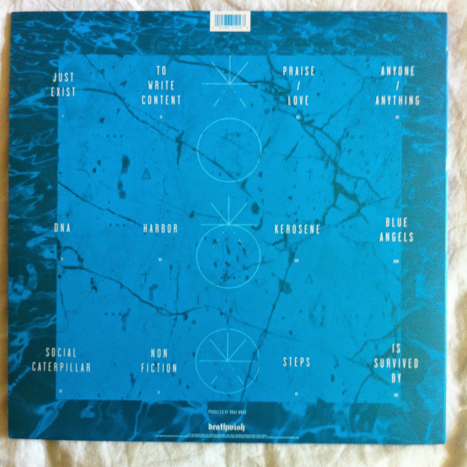
Back cover. Barcode at the top, DW logo at the bottom. Track-listing spread out all over the place. The Asterisk falling through the circles was used on a tour shirt as a back print. I have that shirt but didn't photograph it. If anyone is really that fussed I can throw a quick photo up. 


Inner sleeve. Cool photo, the effect is really odd and creates some blurring on the faces and kind of distorts the features. I can assume that was not accidental though. 


Back of the insert. Lyrics, thank you's and credits. Brad Wood recorded the LP and so it sounds incredible, and also Jon Simmons of Balance and Composure contributes guest vocals. The whole blue on blue layout makes it a little hard to follow, but it looks perfect and I've listened to these songs so many times that I looks at the insert more for the art than the text now I guess. 


On to the deluxe stuff. This is the deluxe that went up for pre-order with the standard variants, but again is kept separate. When I bought this, I paid over the odds on shipping. The store instructed to order this separately and save money, as the added weight on one order would cause the rise in shipping. I ignored that advice as I was fresh out of bed and way too excited. I just wanted to order everything and get out, and as a result paid a little extra. No care though. This variant was /2000 and is still available through the Deathwish E-store.


B-side and back cover. The labels on this copy are nearly identical to the deluxe Parting the Sea, except for the colour scheme and there is no studio credited here (PTSBBAM credited Black Lodge on the label, not the case here). The speed also indicates 45rpm again, however this time that speed is accurate. This LP (all current variants) were mastered at 45rpm. 


Some photography from inside the booklet. The layout again is similar to Parting the Sea, however this time I can show you a little more. I review for a blog called Jivetalk, and late last year I did a video entry to the blog, talking about some records from 2013 I got into. In the video, I talk about Is Survived By whilst flicking through the booklet, so showing a bunch of photographs seems redundant. If you want to have a look: 
https://www.youtube.com/watch?v=VFzAiwEZzkM


The record sits in the sleeve, and credits are printed the same as the standard copies. For the most part this is not interesting, however that means that as all photography is credited to Ryan Aylsworth; he must have spent time in the studio with them in order to get the extra photographs used. 

And finally.


Valentines Day Press. Clear  /200. These went up for sale exclusively through the band's Cinderblock store. I think a few may have been kept for their Valentines show, but I could be wrong. Either way, if you weren't at that gig you had to be online to grab one. Both deluxe copies were also pressed on 180 gram vinyl.


Back cover / B-Side labels. I got this at pre-order. I cut my Valentines meal short and stayed glued to the laptop with my iPhone too. It was the most intense pre-order, at one point I had 7 (accidental due to refresh) copies in my cart but no way to check out as it was clogged to death. The site kept on crashing, and I fought relentlessly for nearly two hours and managed to check out with one copy. But fuck me, it wasn't a good time. My wife even joined in the fun once it became clear that this wasn't a simple 5 minute deal. Valentines well spent, and to boot the gifts I received were Try Me by Self Defense Family and an X-Files season. I ramble on. 


These copies were all exactly the same in layout as the black deluxe with the exception of one detail. Each copy came with a Ryan Aylsworth mounted photograph on the inside cover. With 200 about I would assume there were 40 copies of each photograph and they were all given at random. The collector nerd in me would like all 5, but it's probably not going to happen. A similar situation with the West Coast covers of the TA demo. Anyway,  the copy I received contained a photograph of guitarist Clayton Stevens. 


Spine view. Again, these things get a little battered in transit. 


These posters were also given away in orders. Printed on sort of newspaper type stuff, I got a Modern Life is War poster similar to this when I grabbed Fever Hunting. 
Again, I know a bunch of odd facts about this LP. The recording process was pretty unique, especially vocally. But you've probably had enough. I have a few bits of Is Survived By era merch and promo stickers among other bits and bobs. If everyone ever feels the need, I'll happily photograph them and add them to this post. For tonight though I'm done. 

Thanks for sticking with me again. 

DW151