Well this sneaked it's way into my top 10 of 2014 without much of an effort. Damn, from my 1st listen it just clicked immediately. Everything this album has to offer resonated perfectly, it fits together seamlessly. The artwork, the variant, the production... and with every listen it just pulls me in a little deeper.

Tiny Moving Parts - Pleasant Living - Triple Crown Records - 1st Press - Red // Orange Starburst // 500. I really enjoyed 'This Couch is Long and Full of Friendship' but this record is just a completely different world.

Taking a closer look at the cover art, the band name and album title are embossed. The sleeve has kind of an odd texture to it, and makes the artwork stand out a little more anyway; but embossed sleeves are always a great feature. The A and B markings on the back of the sleeve are embossed too.

B Side // Back Cover. The centre labels are quite neat, the A//B look like they're almost traced. It's a little off to the font from the rest of the sleeve but fits together pretty well.

The variant is something special too. Out of the light it still looks nice, as you can just see the two colours separating in the variant. But when it's held up it becomes something different entirely, almost yellow with orange haze. There were 3 colours available at pre-order, and this one sounded the most interesting by far. There was also Black 180 gram // 250 (rarest colour and sold fairly quick at pre-order) and Light Blue // 1000 was the most common or 'distro' color. This is the only colour available now, and I wouldn't be surprised if there's a re-press before the year is out.

Also, instead of an insert we are treated to a 36'' by 24'' fold out poster. This has both an upside and a downside, but first the upsides. This artwork is brilliant, possibly my favourite album art all year. As far as I can see (although I haven't really studied the text yet) the artist is not credited anywhere. This is similar to the LP artwork, and somewhat depicts the 3 band members. I wish I would hang this up somewhere, but I would always be annoyed that it wasn't in the sleeve where it should be. There is a 46'' X 46'' banner of this on the Triple Crown webstore though, and I may have to grab one; never been a huge fan of banners but I'd break a rule for this one.
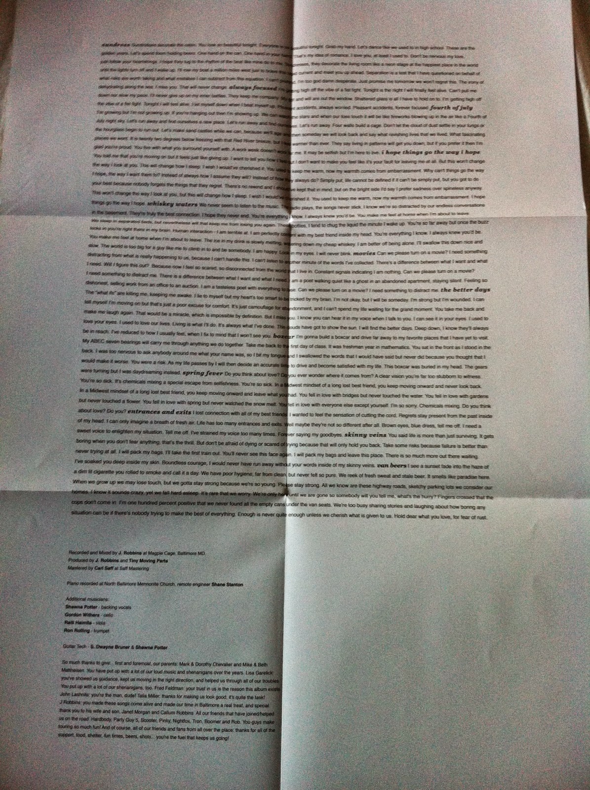
And on to the downside: the text is on the reverse of the poster. Also, another reason I can't hang this up. I like following the lyrics on the first few listens to a new LP, and with these large posters (much the same with '... To the Beat of a Dead Horse) it's sometimes a little hard to follow. On the plus side, the text is well placed and fairly easy to read for what it is. The lyrics on this record are just so on point...

Also, it's worth mentioning that this album was recorded, mixed and produced by J. Robbins. For those that don't know, J. Robbins has played in a bunch of absolutely incredible bands like Jawbox and Burning Airlines. He's also recorded bands like Pianos Become the Teeth and Football Etc. Not particularly relevant to the aesthetics of the record, but I feel that this album is a massive leap forward sonically, so wanted to get the point across.
Thanks for reading!
No comments:
Post a Comment